300x250 Banner ad maker
300x250 Banner ad maker
The 300x250 medium rectangle is the most common display slot on the web, and it punishes everything the feed forgives: it sits beside someone else's article, it's the size of a deck of cards, and it gets a fraction of a second of attention. There's room for one product, one line, and one CTA — nothing more survives. Upload one product photo, steer the offer and direction up front, and get back a pack of static banner-sized poster concepts cropped to read at this exact size.
The free preview is one full-quality 300x250 concept rendered by the real engine — not watermarked, no credit card, view-only so you can judge whether the product and the line survive at deck-of-cards size before you spend. The $29 pack unlocks all 10 concepts in high-res, no-watermark PNG/JPG with ZIP download, plus every Meta size and 4K. Only QA-passed ads are charged; under 12 auto-refunds the difference, and ads never expire.
Examples
300x250 Banner ad maker examples
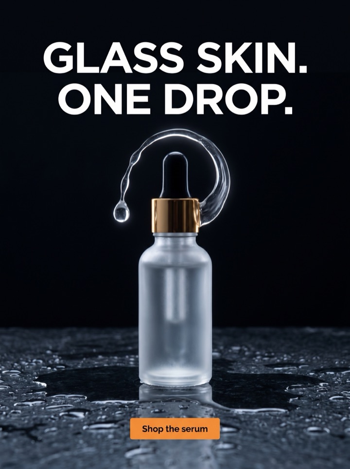
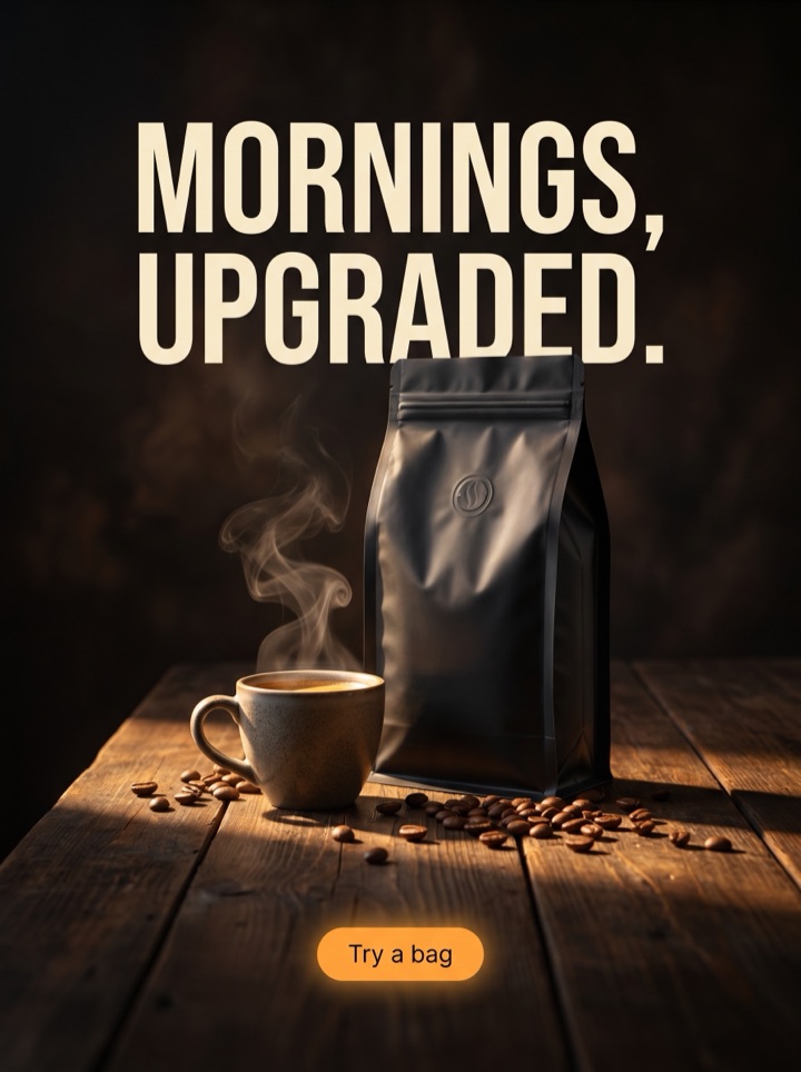
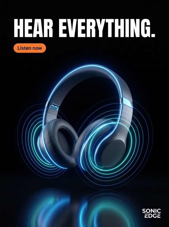
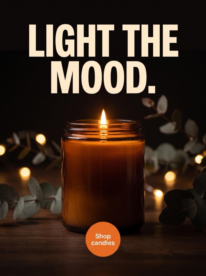
Every concept below comes from the same single product photo, recut for the 300x250 medium rectangle — a tiny canvas where the product has to win the frame before any copy is read. These are static banner-sized posters, not animated HTML5 units (animated banner export is on the roadmap, not live). The angles differ in what they lead with — an offer badge, a proof line, a clean product hero — but every one obeys the same rule: it has to make sense standing alone, beside a stranger's article, with no caption to lean on.


Campaign brief
300x250 Banner Ad Maker campaign brief
A useful 300x250 banner creatives page should help the visitor decide whether an inline rectangle that often appears beside editorial or product-research content fits the product story. Use these notes to test the frame, not just the dimension.
Best use
Reach for this when you need a control creative for the medium rectangle — the slot you'll buy the most of across display and retargeting. The 300x250 is where you prove a product hook works in the least forgiving frame; if an angle lands here, it almost always travels up into roomier sizes, so test it first and adapt the winner wider.
Asset to upload
One product photo with a clear silhouette and enough contrast to carry a small offer badge. Edges matter at this size — a product that reads as a clean shape survives the crop; a busy or low-contrast shot turns to mush in a deck-of-cards frame. Upload the sharpest, simplest hero you have.
First test
Compare an offer-led rectangle against a proof-led rectangle, same product crop, so the winner is a message and not just a prettier picture. The 300x250 has room for exactly one reason to click — this test tells you whether your buyer moves on price or on trust before you scale either.
Copy direction
Steer toward one line, not three. Set the single offer or proof point in your direction notes — '20% off', 'free shipping', a price — because text is baked into each poster and a crowded small frame is the fastest way to lose it. The fewer words you steer toward, the bigger they render and the better they survive.
Human review
Before exporting, shrink the preview to actual 300x250 pixels and look at it the way it'll appear — small, beside content that isn't yours. If the product silhouette, the one line, and the CTA all read at that size, it's a runner. If you have to squint at any of the three, regenerate tighter before you pay.
How it works
Build 300x250 Banner Ad Maker creative around the frame.
1
Upload the product
One clean photo with a clear silhouette and good contrast. This single shot feeds every concept, and at 300x250 a simple, well-lit product is the difference between a hero and a smudge.
2
Steer the one line
Set the single offer or proof point and the direction up front — text is baked into each poster, so this is where the copy is decided. Pick one reason to click; the rectangle has no room for two.
3
Review at actual size
Concepts come back in a few minutes. View each at true 300x250 and keep the ones where the product, the line, and the CTA all read at a glance. Regenerate anything that goes muddy when it's small.
4
Export the runners
Unlock high-res, no-watermark PNG/JPG with ZIP download for the winners — plus every Meta size if you want to adapt the message wider. Only QA-passed ads are charged; under 12 auto-refunds the difference. These are static banner posters; animated HTML5 export isn't live yet.
Ad angles included
Ad angles for 300x250 Banner ad maker
The 300x250 medium rectangle is the workhorse of display advertising — the most-bought slot on the open web, and the one with the least mercy. It's small, it sits inside someone else's page, and it has to earn a click with no caption, no sound, and barely any second look. That constraint is the whole strategy: one product, one line, one CTA, all legible at deck-of-cards size. Product AdKit makes static banner-sized concepts cut for exactly this frame, so you're testing real layouts at the real size instead of designing for a comp that never shrinks.
Field notes
300x250 Banner Ad Maker field notes
These field notes are a quick human quality pass for 300x250 banner creatives and an inline rectangle that often appears beside editorial or product-research content before you turn previews into production ads.
Creative review
- The only test that matters for a 300x250: shrink it to actual pixels. A layout that looks balanced at desktop comp size can collapse into a gray smudge at the real placement — if you didn't check small, you didn't check.
- One reason to click, not two. The rectangle has room for an offer or a proof point, not both. Two competing messages at this size means the eye picks neither and scrolls.
- Product silhouette is everything here. At 300x250 the product reads as a shape before it reads as a thing — a clean, high-contrast outline survives; a busy hero against a busy background dies.
- The medium rectangle is your cheapest, highest-volume test bed. Prove the hook here first; a concept that lands at 300x250 almost always scales up into roomier sizes, but the reverse fails constantly.
Placement review
- These are static banner posters. If your media plan needs animated or expandable HTML5 units, that's a different deliverable — animated export is roadmap, not live, so plan the 300x250 as a still.
- The CTA should be a word or two, not a sentence. 'Shop now' fits; 'Discover the collection that changes everything' becomes a smear. Steer the copy short before you generate.
- It has to make sense standing alone. The rectangle appears beside articles and research content that has nothing to do with you — if the ad leans on surrounding context to be understood, it isn't an ad, it's a footnote.
Export review
- Offer badges need contrast, not size. A small '20% off' chip in a color that pops off the product reads better than a big badge that fights the hero for the frame.
- If you only run one display size, run the 300x250. It's the slot you'll actually buy the most of, so it deserves the concept you trust most — not a leftover crop from a feed ad.
Sizes and exports
Sizes and exports for 300x250 Banner ad maker
For 300x250 banner creatives, the export shape should support the product story. Static posters are available first; display and HTML5 exports stay clearly labeled as agency or roadmap workflows until enabled.
300x250 display
Use 300x250 display for compact display inventory where the product image and offer for 300x250 banner creatives must read at small size.
336x280 large rectangle
Use 336x280 large rectangle for compact display inventory where the product image and offer for 300x250 banner creatives must read at small size.
728x90 leaderboard
Use 728x90 leaderboard when the product needs a wide lockup with a short hook and one CTA.
300x600 half-page
Use 300x600 half-page for a tall display concept with room for product, benefit, offer, and button.
320x50 mobile
Use 320x50 mobile for 300x250 banner creatives only when the hook is short and the product silhouette is instantly recognizable.
970x250 billboard
Use 970x250 billboard when the product needs a wide lockup with a short hook and one CTA.
300x250 Banner Ad Maker pages should help a founder decide what to make next: which product image to use, which hook to test, which placement to export, and what should stay locked behind a paid pack. That is why Product AdKit centers the product workflow instead of offering a generic design surface.
Copy examples
Hooks, CTAs, and mistakes for 300x250 Banner ad maker.
Headline hooks
- One product, one line, one click. That's all a 300x250 gets.
- The most common ad slot on the web. Make it count.
- Shrink it to actual size. If it still reads, run it.
- Built for the rectangle, not stretched into it.
- Deck-of-cards canvas. Pick one reason to click.
- Legible small beats clever big — every time at this size.
- Beside someone else's article. Yours still has to make sense.
- 20% off, full stop. Anything longer won't survive the crop.
CTA examples
- Generate this size
- Preview the format
- Export the pack
- Check the layout
- Start from a product photo
Common mistakes
- Designing for the desktop comp and never checking the concept at actual 300x250 pixels, where it falls apart.
- Cramming an offer and a proof line and a logo into a frame that has room for exactly one message.
- Uploading a busy, low-contrast product photo whose silhouette turns to mush at deck-of-cards size.
- Writing a CTA that's a full sentence — it smears at this size; keep it to a word or two.
- Expecting animated or expandable HTML5 output — these are static banner posters, and animated export isn't live.
Editorial review
300x250 Banner Ad Maker review checklist
Use this 300x250 banner creatives checklist as a human quality pass before turning previews into production ads.
1
Did you view the concept at actual 300x250 pixels, not just the desktop comp?
2
Does the product silhouette read as a clean shape at deck-of-cards size?
3
Is there exactly one reason to click — one offer or one proof line, not both?
4
Is the CTA short enough to stay crisp when the unit renders small?
5
Does the ad make sense standing alone, beside content that isn't yours?
FAQ
300x250 Banner ad maker questions
What's the safe area for a 300x250 medium rectangle?
The whole 300x250 is your frame — display rectangles aren't cropped by app controls the way Stories are — but treat the outer few pixels as breathing room, not active space. Keep the product, the one line, and the CTA pulled in from the edges so nothing reads as touching the border. The real constraint isn't a safe zone, it's size: everything has to be legible when the unit renders small beside other content.
What's the recommended resolution for 300x250 ads?
Design and export at 300x250 at minimum, and pull 2x (600x500) for retina display inventory so the product and text stay crisp on high-DPI screens. Product AdKit renders high-res files you can scale down cleanly, and the paid pack includes 4K source if you want maximum headroom. The display unit itself stays 300x250 — the extra resolution just keeps it sharp.
How much text can a 300x250 actually hold?
One headline of a few words, one short CTA, and at most a small offer badge — that's the honest ceiling. Because text is baked into each poster, you steer the copy short up front rather than trimming it on a canvas later. If you find yourself wanting a second line, that's the signal to split it into a second concept and test the two messages against each other instead of cramming both.
Do I need every display banner size, or just the 300x250?
Start with just the 300x250 — it's the most-purchased display slot, so a concept that wins here is your strongest control. Prove the hook at this size, then adapt only the winning message into wider banners or taller units if your plan needs them. The $29 pack includes every Meta size too, so you can expand later without regenerating. Note these are all static banner concepts; animated HTML5 export is on the roadmap, not live.
Related tools