Instagram Story ad maker
Instagram Story ad maker
A Story ad has a hostile layout: the top ~250px is buried under the profile and progress bar, the bottom ~250px under the reply field and CTA sticker. Anything important up there gets covered. Upload one product photo and get a pack of 1080x1920 poster concepts that keep the product and the headline in the middle band where they survive the crop — then steer the direction and regenerate the framing that holds.
Your free preview is one full-quality 9:16 concept rendered by the real engine — not watermarked, just view-only and 2K, so you can judge whether the product and CTA actually clear the Story safe zones before paying. No credit card to look. The $29 pack unlocks all 10 concepts as high-res, no-watermark PNG/JPG in every Meta size with ZIP download. Only QA-passed ads are charged; under 12 passing auto-refunds the difference, and ads never expire.
Examples
Instagram Story ad maker examples
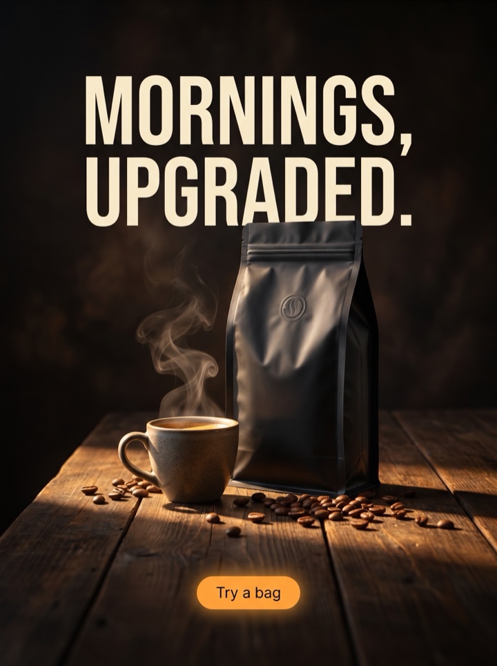
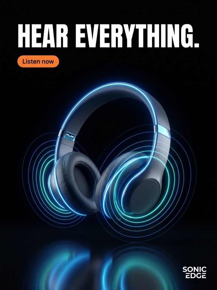
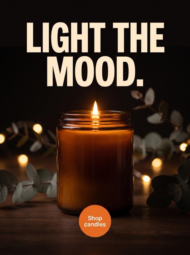
All six below start from the same single product photo, recut for the 9:16 Story frame specifically — which means every one of them treats the top and bottom ~250px as off-limits and fights for attention in the center band. The angles differ; the safe-area discipline doesn't. Each is a static poster sized 1080x1920, not a motion ad.



Campaign brief
Instagram Story Ad Maker campaign brief
A useful instagram story creatives page should help the visitor decide whether an Instagram Story frame where the product has to fit around top and bottom app controls fits the product story. Use these notes to test the frame, not just the dimension.
Best use
Reach for this when you're running Stories and Reels paid placements and a feed-built square keeps getting its headline or CTA swallowed by the interface. The pack gives you several 9:16 concepts that already respect the safe band, so you can pick the framing that survives the crop instead of nudging text up and down in a design tool.
Asset to upload
One clean product photo — a tall crop or a centered image with room to breathe works best, because the product has to live in the middle third while the top and bottom ~250px stay clear. If the shot is wide or busy at the edges, the layout has less room to keep the CTA out of the reply-bar zone.
First test
Pit a benefit-led Story concept against a proof-led one, same product crop, same offer. Story viewers decide in the first second, so the test is really which center-band message earns the tap before the next tap dismisses you — not which one is prettier.
Copy direction
Steer toward one short headline and one short CTA before you generate — the Story frame has no room for a paragraph, and text is baked into each poster, so you set the message up front rather than editing it on a canvas. Tell the engine to keep copy in the middle band; long hooks are the first thing that collides with the UI.
Human review
Before you export, mentally drop the real Story chrome onto the frame: profile row and progress bar over the top ~250px, reply field and CTA sticker over the bottom ~250px. If the headline or CTA lands under either, kill that concept or regenerate — a covered CTA is a wasted impression.
How it works
Build Instagram Story Ad Maker creative around the frame.
1
Upload the product
One clean photo, ideally a tall or centered crop with space to breathe. This single shot feeds every 9:16 concept, and the product needs room to sit in the middle band away from the top and bottom controls.
2
Steer the Story
Set the direction, the offer, and one short headline plus a short CTA. Text is baked into each poster, so this is where you shape the copy — and where you tell the engine to keep everything inside the safe band, not up against the interface.
3
Review against the chrome
Concepts come back in a few minutes. Check each one as if the profile strip, progress bar, and reply field were already on it — mark the framings that keep product and CTA in the center third, regenerate the ones that drift into the safe zones.
4
Export the runners
Unlock the winners as high-res, no-watermark 9:16 files — plus the 4:5 and 1:1 versions from the same pack for feed. Only QA-passed ads are charged, under 12 passing auto-refunds the difference, and nothing expires.
Ad angles included
Ad angles for Instagram Story ad maker
A 9:16 Story ad is 1080x1920 of full-screen attention with two no-go zones baked in: the top ~250px disappears under the profile and progress bar, the bottom ~250px under the reply field and the CTA sticker. The whole craft is keeping the product and the one line that matters in the middle band where the interface can't touch them. Every concept on this page is built around that constraint, because a beautiful headline covered by app chrome is a headline nobody read.
Field notes
Instagram Story Ad Maker field notes
These field notes are a quick human quality pass for instagram story creatives and an Instagram Story frame where the product has to fit around top and bottom app controls before you turn previews into production ads.
Creative review
- First check on any Story ad: drop the real chrome on it in your head — profile and progress bar over the top quarter, reply bar over the bottom quarter. If your headline or CTA lives in either, it's effectively invisible.
- The middle band is the whole frame for practical purposes. Treat roughly the center 1080x1420 as your real canvas and design like the top and bottom 250px don't exist, because to the viewer they barely do.
- Vertical reading order matters here more than in a square: eye lands center, then drops. Product center, short headline just above or below it, CTA in the lower-middle but above the reply bar — that's the layout that survives.
- One headline, one CTA. Stories give you a second of attention; a second line is usually the thing that ends up colliding with the interface or getting skipped entirely.
Placement review
- Don't confuse 9:16 with motion. Product AdKit makes static Story posters — the hook has to land on a still frame, with no swipe, sound, or animation doing the work for you.
- Full-bleed lifestyle backgrounds read great vertically, but only if you darken or clear the zone behind the text. A headline over a busy background at Story scale is mush.
- The CTA is the most-covered element on a Story ad because founders park it at the very bottom out of habit. Float it into the lower-middle band and it actually gets seen above the sticker.
Export review
- If a concept only works because the caption explains it, it fails — Stories are full-screen and there's no caption beside the frame to lean on.
- The 9:16 layout is the strict one in your pack. Get product and CTA clean here and the 4:5 and 1:1 crops from the same pack fall into place with less fighting.
Sizes and exports
Sizes and exports for Instagram Story ad maker
For instagram story creatives, the export shape should support the product story. Static posters are available first; display and HTML5 exports stay clearly labeled as agency or roadmap workflows until enabled.
9:16 story
Use 9:16 story for full-screen mobile placements where the product and CTA for instagram story creatives need strong top-to-bottom spacing.
1:1 square
Use 1:1 square when the instagram story creatives concept needs a balanced product, hook, and CTA layout.
4:5 feed
Use 4:5 feed when the product in instagram story creatives needs more vertical room than a square ad but still appears in feed.
9:16 story/reels
Use 9:16 story/reels for full-screen mobile placements where the product and CTA for instagram story creatives need strong top-to-bottom spacing.
Facebook feed
Use Facebook feed when the product in instagram story creatives needs more vertical room than a square ad but still appears in feed.
Instagram Story Ad Maker pages should help a founder decide what to make next: which product image to use, which hook to test, which placement to export, and what should stay locked behind a paid pack. That is why Product AdKit centers the product workflow instead of offering a generic design surface.
Copy examples
Hooks, CTAs, and mistakes for Instagram Story ad maker.
Headline hooks
- Centered, captioned, and clear of the reply bar.
- Your headline, where the profile strip can't bury it.
- One product. One line. One tap — all in the middle third.
- Built for 9:16, not squeezed into it.
- The CTA sits where thumbs actually are.
- Full-screen vertical, safe zones respected by default.
- Story-native, not a square with the corners cropped off.
- Middle-band product, edge-to-edge attention.
CTA examples
- Generate this size
- Preview the format
- Export the pack
- Check the layout
- Start from a product photo
Common mistakes
- Parking the headline in the top ~250px, where the profile row and progress bar cover it the moment the Story loads.
- Dropping the CTA at the very bottom edge, straight under the reply field and the system CTA sticker.
- Reusing a square feed crop as-is and letting the product float dead-center with empty, wasted space top and bottom.
- Stacking two or three lines of copy into a frame that only has room for one short headline and one CTA.
- Treating it like a video frame — expecting motion or sound to carry a hook that has to land on a static poster.
Editorial review
Instagram Story Ad Maker review checklist
Use this instagram story creatives checklist as a human quality pass before turning previews into production ads.
1
Does the headline sit clear of the top ~250px where the profile row and progress bar land?
2
Is the CTA in the lower-middle band, above the bottom ~250px reply-bar and sticker zone?
3
Does the product live in the center third rather than floating like a resized square?
4
Does the hook land on a static frame with no motion, sound, or caption doing the work?
5
If there's a full-bleed background, is the zone behind the text darkened enough to stay legible at Story scale?
FAQ
Instagram Story ad maker questions
What are the safe zones for an Instagram Story ad, and how does this handle them?
Story frames are 1080x1920, and roughly the top 250px (profile row, progress bar) and bottom 250px (reply field, CTA sticker) get covered by the interface. The concepts here are laid out to keep the product and CTA in the middle band, clear of both. You still review each one yourself — drop the chrome on it mentally before export — but the starting layout already respects the no-go zones instead of fighting them.
What resolution should a 9:16 Story ad be?
1080x1920 at a 9:16 ratio is the spec, and that's what the pack exports. Your free preview comes back at 2K and view-only so you can judge the framing; the $29 pack unlocks the full-resolution, no-watermark PNG/JPG files for download. Build at full size from the start — never upscale a smaller crop into the Story frame, because soft product detail reads worse full-screen than it does in feed.
How much text can a Story ad carry before it's too much?
Practically, one short headline and one short CTA. The middle band is the only safe real estate, and it fills fast — a second line usually ends up either skipped or colliding with the app controls. Because text is baked into each poster, you steer the copy short up front and regenerate if it's crowding, rather than editing it down later on a canvas.
Do I need a separate 9:16 version, or can I just run my square ad in Stories?
You can run a square in Stories, but it floats in the middle of a vertical frame with dead space above and below, and it looks resized rather than native. A purpose-built 9:16 uses the full height and places the CTA where it survives the reply bar. The pack gives you the 9:16 alongside 4:5 and 1:1 from the same product photo, so you're not choosing — run the Story-native crop in Stories and the square in feed.
Related tools