Square 1:1 ad maker
Square 1:1 ad maker
The square 1:1 is the one ad you run when you don't know where it'll land — it holds its shape in the Facebook feed, the Instagram feed, the explore grid, and most retargeting slots without a re-crop. The catch: a square gives the product, the offer, and the CTA the same center, so they fight for it. Upload one product photo and get back a pack of 1080x1080 posters where the offer still reads with the caption collapsed, then regenerate the angles that survive the scroll.
Your free preview is one full-quality 1:1 ad rendered by the real poster engine — 2K, no watermark, view-only, no credit card. Use it to judge whether the offer holds the center of the square before you spend. The $29 pack unlocks all 10 concepts in every Meta size — 1:1, 4:5, and 9:16 — at 4K with no-watermark PNG/JPG and a ZIP download. Only QA-passed ads are charged; under 12 pass and the difference auto-refunds. Ads never expire.
Examples
Square 1:1 ad maker examples
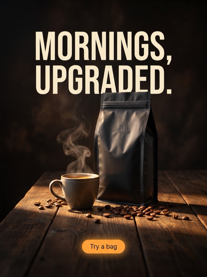
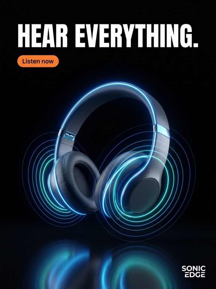
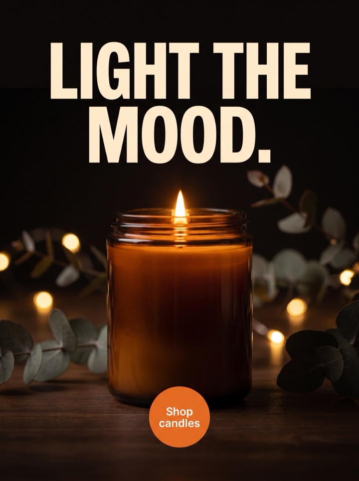
Every example below is the same product photo recut into a different reason to click, then laid out for a 1080x1080 square. The thing to watch across all six: the product stays center-weighted, and the offer and CTA sit where the feed crop and a collapsed caption can't bury them. A square has no spare margin to hide copy in, so each angle has to earn its center.



Campaign brief
Square 1:1 Ad Maker campaign brief
A useful square 1:1 creatives page should help the visitor decide whether a Meta 1x1 frame that must work across broad square inventory without relying on caption context fits the product story. Use these notes to test the frame, not just the dimension.
Best use
Reach for the square first when you want one dependable control creative that can run anywhere without a re-crop. The 1:1 is the cross-placement default — Facebook feed, Instagram feed, explore, most retargeting — so it's the angle you test before you cut vertical variants. Start here, find the message that works, then expand into 4:5 and 9:16.
Asset to upload
One product photo with simple edges and real empty space around the subject — the square needs room to drop an offer near the product without the two colliding in the center. Avoid a shot that's already busy edge-to-edge; a 1:1 crop has no margin to spare, and clutter is what makes square ads read as a resized banner.
First test
Compare a product-first square against a stronger offer-led square while keeping the crop identical. The square's whole job is to explain the offer with the caption hidden, so the test you actually want is whether the message or the product should own the center — change one variable, not the layout.
Format choice
Square 1:1 is the safe default; reach for 4:5 instead when the product needs vertical room — tall packaging, scale, texture, a bundle that stacks. Square wins when the campaign needs one creative that survives every feed crop unchanged. The $29 pack gives you 1:1, 4:5, and 9:16, so you can run the square as the control and the vertical as the challenger.
Human review
Before exporting, view each square the way the feed shows it: caption collapsed, at thumbnail size. If the offer disappears when the caption is hidden, the layout failed the one thing a square is for. Check that nothing important rides the outer edge where a tighter placement crop could shave it off.
How it works
Build Square 1:1 Ad Maker creative around the frame.
1
Upload the product
One clean photo with simple edges and breathing room around the subject. This single shot feeds every square in the pack, so give it enough negative space to drop an offer near the product without a center collision.
2
Steer the offer
Set the direction, the offer, and the CTA before you generate — text is baked into each 1080x1080 poster, so this is where you shape the copy. Keep the hook short enough to share the center third with the product.
3
Review at thumbnail
One full-quality preview comes back in a few minutes — view-only, no watermark. Judge it caption-collapsed and small: does the offer still hold the square? Mark the angles that survive the scroll and regenerate in that direction.
4
Export the control
Unlock the pack for 4K, no-watermark 1:1 files plus the 4:5 and 9:16 variants, ZIP included. Run the square as your cross-placement control. Only QA-passed ads are charged; under 12 auto-refunds the difference.
Ad angles included
Ad angles for Square 1:1 ad maker
The 1080x1080 square is the workhorse ratio of paid social — it's the one creative that holds its shape across the Facebook feed, the Instagram feed, the explore grid, and most retargeting inventory without a single re-crop. That portability is also its constraint: a square hands the product, the offer, and the CTA the same center, and on broad square inventory there's no caption to lean on, so the layout has to explain itself alone. Every angle on this page is built to keep the offer legible when the frame is tight and the caption is collapsed.
Field notes
Square 1:1 Ad Maker field notes
These field notes are a quick human quality pass for square 1:1 creatives and a Meta 1x1 frame that must work across broad square inventory without relying on caption context before you turn previews into production ads.
Creative review
- Search behavior worth knowing: shoppers and marketers look for a 'square ad' or '1080x1080', not 'Meta 1x1'. The dimension is the name people use — the square is the format, not the jargon.
- The square's superpower is portability: one 1:1 creative runs in the Facebook feed, the Instagram feed, explore, and most retargeting slots with no re-crop. That's why it's the control you test before cutting any vertical.
- A square gives the product, the offer, and the CTA the same center — the failure mode is all three fighting for it. Give the product the center and push the CTA to a lower safe band so the eye isn't asked to land in one spot twice.
- Reach for 4:5 over square when the product needs height: tall packaging, scale, texture, or a bundle that stacks. Square wins when you need one creative that survives every feed crop unchanged.
Placement review
- The real test for any square is the caption-collapsed thumbnail. Broad square inventory shows your ad with no caption context, so if the offer dies when the caption is hidden, the layout failed.
- Keep important copy out of the outer ~6% of the square. A tighter placement crop or a UI overlay can shave the edges, and a CTA riding the bottom edge is the first thing to go.
- Center-weight beats edge-weight in a 1:1. A product floating to one corner with the offer in the opposite corner reads as a resized banner, not a feed-native square.
Export review
- 1080x1080 is the upload baseline; the pack exports at 4K so the same square holds up if you ever push it into a larger placement without re-rendering.
- Don't run a square because it's the default and stop there. The square earns its slot as a control; the vertical you test against it is where you usually find the lift.
Sizes and exports
Sizes and exports for Square 1:1 ad maker
For square 1:1 creatives, the export shape should support the product story. Static posters are available first; display and HTML5 exports stay clearly labeled as agency or roadmap workflows until enabled.
1:1 square
Use 1:1 square when the square 1:1 creatives concept needs a balanced product, hook, and CTA layout.
4:5 feed
Use 4:5 feed when the product in square 1:1 creatives needs more vertical room than a square ad but still appears in feed.
9:16 story/reels
Use 9:16 story/reels for full-screen mobile placements where the product and CTA for square 1:1 creatives need strong top-to-bottom spacing.
Facebook feed
Use Facebook feed when the product in square 1:1 creatives needs more vertical room than a square ad but still appears in feed.
Square 1:1 Ad Maker pages should help a founder decide what to make next: which product image to use, which hook to test, which placement to export, and what should stay locked behind a paid pack. That is why Product AdKit centers the product workflow instead of offering a generic design surface.
Copy examples
Hooks, CTAs, and mistakes for Square 1:1 ad maker.
Headline hooks
- One square. Every feed it lands in.
- The offer reads even with the caption closed.
- Built for 1080x1080, sharp at 4K.
- Center-weighted so the product never gets lost.
- Your control creative, before you cut vertical.
- Square holds its shape — no re-crop, no surprises.
- Runs in feed, explore, and retargeting unchanged.
- Reads at thumbnail. That's the whole job.
CTA examples
- Generate this size
- Preview the format
- Export the pack
- Check the layout
- Start from a product photo
Common mistakes
- Letting the product, offer, and CTA all crowd the exact center of the square — give the product the center and move the CTA to a lower safe band.
- Judging the square at full size with the caption showing, then watching the offer vanish in the caption-collapsed feed thumbnail.
- Floating the product into a corner with the offer in the opposite corner — that's a resized banner, not a feed-native 1:1.
- Running a square because it's the default and never testing a 4:5 challenger where a tall product would actually breathe.
- Riding the CTA on the outer edge where a tighter placement crop or UI overlay can shave it off.
Editorial review
Square 1:1 Ad Maker review checklist
Use this square 1:1 creatives checklist as a human quality pass before turning previews into production ads.
1
Does the offer still read when the caption is collapsed and the ad is at thumbnail size?
2
Is the product center-weighted, with the CTA in a lower safe band rather than fighting for the same center?
3
Is all important copy inside the center area and clear of the outer edge a tighter crop could shave?
4
Does the headline fit the center third beside the product, or is it two ideas crowding one square?
5
Did you test a 4:5 or 9:16 challenger against the square instead of shipping the default alone?
FAQ
Square 1:1 ad maker questions
What size should a square ad be — 1080x1080 or something larger?
Upload and run at 1080x1080; that's the baseline Meta and Instagram use for square placements. Product AdKit renders the pack at 4K, so the same 1:1 stays sharp if you ever push it into a larger surface without re-rendering. Keep the important copy inside the center area and out of the outer few percent, since a tighter placement crop can shave the edges.
When should I use a square instead of a 4:5 feed ad?
Use the square when you want one dependable creative that runs everywhere without a re-crop — Facebook feed, Instagram feed, explore, retargeting. Reach for 4:5 when the product needs vertical room: tall packaging, scale, texture, or a stacked bundle. Most founders run the square as the control and test a 4:5 challenger; the $29 pack gives you both plus 9:16.
How much text survives a 1:1 crop?
Less than you'd think, because the square shows on broad inventory with the caption collapsed, so the ad has to explain itself with no caption help. Keep it to one short headline and a clear CTA that fit the center third beside the product. A long hook forces the product smaller or pushes copy to the edges where a crop can clip it. Steer the copy short up front — text is baked in, not edited later.
Do I need every Meta size, or is the square enough?
The square alone covers a lot — it's the cross-placement default — but it's a control, not a complete plan. Vertical 9:16 reaches story and reels real estate the square can't, and 4:5 often out-pulls square in-feed by claiming more vertical height. The $29 pack delivers all three (1:1, 4:5, 9:16) from the same photo, so run the square as your baseline and add the verticals where the placement earns them.
Related tools