discount ad generator
Discount ad generator
Turn a product photo into discount-angle ad variations — percent-off, dollar-off, and sale-price posters — for Facebook, Instagram, and paid social testing.
Free discount-ad previews are full-quality and view-only — enough to judge whether the offer number lands. Unlock the full pack only once a price-led version is worth exporting as high-res, no-watermark files, ZIP download, and Meta sizes.
Examples
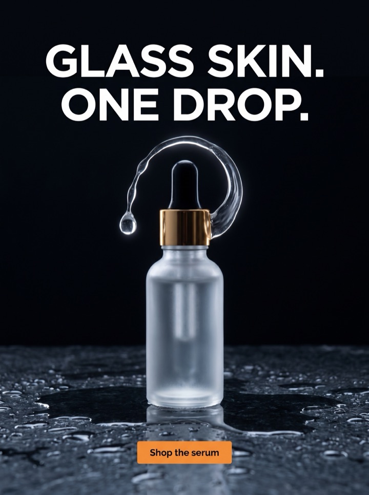
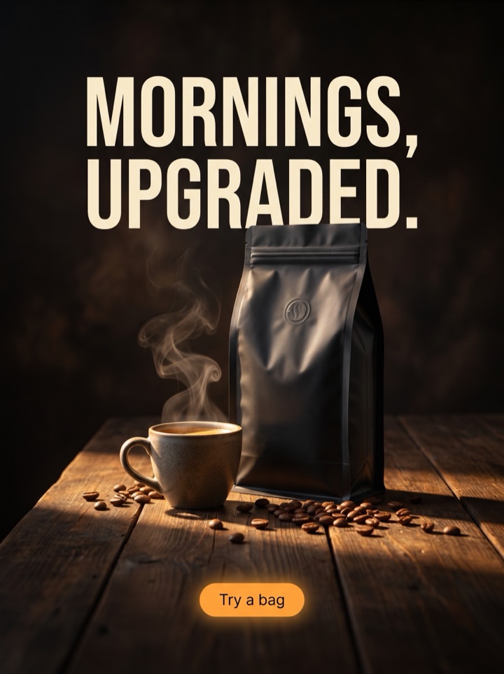
Discount ad generator examples
The discount angle has more than one shape. A percent-off ad, a dollar-off ad, and a bundle-savings ad each frame the deal differently, and each one wins with a different audience. The examples below show the same product photo carrying a few distinct ways to lead with price.


Campaign brief
Discount ad campaign brief
The discount angle works when the shopper already wants the product and the price is the last objection. These notes help you frame a real offer instead of just stamping "Sale" on a poster.
Best use
Lead with a discount when the product is already considered — a returning visitor, a retargeting audience, an abandoned cart. A discount ad gives an interested buyer a reason to stop waiting; it rarely creates desire from scratch.
Asset to upload
Use a clean, premium product photo with breathing room for the offer block and the struck-through anchor price. Avoid a photo that already looks discounted — the design should look full-price so the deal feels like a deal.
First test
Run one percent-off version against one dollar-off version of the same product. On low-ticket items a percentage often wins; on higher-ticket items a flat dollar amount usually feels bigger. Let the click-through, not your gut, decide.
Anchor price
Show the original price struck through next to the sale price. The discount only lands when the shopper can see what they were going to pay. A number with no anchor reads as "the price," not "a saving."
Deadline cue
A discount earns urgency from a real end point — "ends Sunday," "while stock lasts." Add the deadline only if it's true. A fake countdown trains your best customers to wait for the next sale.
Margin check
Before you publish, confirm the offer still leaves room after ad spend. The discount angle is the easiest to over-give: a poster that looks great can quietly sell at a loss if the percentage was chosen for drama, not math.
How it works
Build a discount ad where the number does the work.
1
Set the offer
Decide the actual deal first — 30% off, $15 off, buy-2-save-25%, or a code. The offer shapes the layout, so pick the framing before you pick the design.
2
Anchor it
Generate versions that pair the sale price with the struck-through original. The contrast between the two numbers is the persuasion; the product photo keeps the deal feeling worth it.
3
Preview the offer block
Review view-only previews and check the number first: is the discount the loudest thing on the poster, and is it still readable at phone width before you pay?
4
Export the winner
Unlock high-res files once a price-led version reads cleanly in feed and story. When the next sale runs, regenerate with the new percentage instead of rebuilding.
Examples
Discount ad generator examples
"Discount" is one angle with several shapes. The percentage, the flat dollar amount, the bundle, and the coupon code all say "save money," but they land differently depending on price point and audience. Test a few framings of the same offer rather than guessing which one fits.
Field notes
Discount ad field notes
What follows is the human-judgment layer for the discount angle specifically — the small calls that separate a deal ad that converts from one that just trains people to wait for the next sale.
Creative review
- Make the discount the single loudest element. If the shopper has to hunt for the percentage, the product photo and the offer are fighting for the same space — give the number the win.
- Round, clean offers read faster than odd ones. "25% off" beats "23% off" in a scrolling feed, even if the cents are nearly the same. Save the awkward math for the checkout page.
- Always show the anchor. A sale price with the original struck through next to it converts better than a lone "now $39," because the saving is doing the persuading, not the price itself.
- Test percent-off against dollar-off on the same product. Below roughly $50, a percentage usually feels bigger; above it, a flat dollar amount often hits harder. Don't assume — run both.
Placement review
- Keep the product looking full-price. The deal feels valuable when the design is premium and only the number signals the cut. Stacked starbursts and clearance-bin red make the same offer feel cheap.
- Tie the discount to a reason when you can — launch, season, overstock, first order. "30% off because it's our birthday" protects margin and brand better than a perpetual "always on sale."
- Check the offer survives ad spend. A discount ad is the easiest to make look great and quietly unprofitable; confirm the margin after CAC before you scale it.
Export review
- Only claim a deadline that's real. A countdown that resets every week teaches your most loyal buyers to never pay full price — the discount angle's most expensive long-term mistake.
- Match the ad to the landing page. If the poster says "30% off," the offer has to be live and obvious on arrival. A discount that disappears on the click burns trust faster than no ad at all.
Sizes and exports
Sizes and exports for discount ads
The offer number has to stay legible after the crop. A discount ad that reads on desktop can lose its struck-through price at phone width, so check the number in each placement before you export. Static posters ship first; display and HTML5 exports stay clearly labeled as agency or roadmap workflows until enabled.
1:1 square
The default for a discount ad: balanced room for the product, a large offer number, and the anchor price without crowding.
4:5 feed
More vertical space lets the struck-through price and the sale price stack cleanly above the CTA — useful when the saving needs two lines.
9:16 story/reels
Full-screen mobile. Put the discount near the top so it survives the safe-zone crop, and give the deadline cue room at the bottom.
Coupon code chip
If the offer is a code, keep the SAVE20-style chip and "use at checkout" line large enough to read in feed — a code nobody can copy is a wasted discount.
A discount ad lives or dies on one decision: how you frame the number. Product AdKit builds the offer block, the struck-through anchor, and the deadline cue into the layout, then lets you regenerate with a new percentage, price, or code so the next sale's pack takes a minute, not an afternoon.
Copy examples
Hooks, CTAs, and mistakes for discount ads.
Headline hooks
- 30% off — today only.
- Save $15 on the [product] you keep coming back to.
- Was $79. Now $54. Same product, better timing.
- Buy 2, save 25% — the bundle costs less than two singles.
- Your cart's been waiting. Here's 20% to finish it.
- Use code SAVE20 before Sunday.
- Last chance: this price ends with the season.
- First order? Take 15% off your first [product].
CTA examples
- Claim the deal
- Get 30% off
- Shop the sale
- Use code at checkout
- Save before it ends
Common mistakes
- Showing a sale price with no struck-through anchor, so the "deal" just reads as the regular price.
- Picking the discount for drama instead of margin, then quietly selling at a loss once ad spend is counted.
- Burying the number under starbursts and three colors until the ad looks like a clearance bin, not a smart buy.
- Running a "limited-time" deadline that resets every week, training loyal customers to never pay full price.
- Promising 30% off in the ad when the landing page shows full price — the click lands, the trust doesn't.
Examples
Discount ad generator examples
Run this pass on any discount creative before it goes live — it catches the offer mistakes that don't show up until the campaign is already spending.
1
Is the discount the loudest element, and is the number still readable at phone width after the placement crop?
2
Is the original price shown struck through, so the saving — not just the price — is doing the persuading?
3
Does the offer still leave margin after ad spend, and is any deadline in the ad actually real?
4
Does the product still look premium and full-price, so the deal feels like a deal rather than a clearance dump?
5
Does the landing page show the same discount on arrival, so the click doesn't land on a full-price surprise?
FAQ
Discount ad generator questions
What makes a discount ad different from a normal product ad?
A discount ad leads with the offer, not the product story. The percent-off, dollar-off, or sale price is the loudest element, the original price is shown struck through as an anchor, and the product still has to look worth buying at the new number. Product AdKit builds the offer block, the price anchor, and the deadline cue into the layout instead of pasting a sale sticker on a generic poster.
Should I put the actual discount number in the ad?
Usually yes. A specific number like 30% off or $15 off outperforms a vague Sale on or Now reduced because shoppers can do the math in the feed. You set the headline, offer percentage, anchor price, and CTA up front, so generate both versions and test 30% off against $15 off on the same product before you export.
How do I keep a discount ad from looking cheap?
Keep the product photo premium and let one clean number carry the offer. Avoid stacked badges, starbursts, and three competing colors. A discount ad reads as a smart deal when the product still looks desirable; it reads as a clearance bin when the design shouts louder than the product.
Can I export discount ads for Facebook and Instagram?
Yes. Product AdKit focuses first on Meta-ready static posters in square, 4:5 feed, and 9:16 story sizes, so the offer number and struck-through price stay legible at phone width. Free previews are view-only; paid packs unlock high-res, no-watermark exports and ZIP downloads.
Related tools