premium product ad generator
Premium Product ad generator
Turn a product photo into premium-angle ad variations that sell on craft and quality, ready to test on Facebook, Instagram, and paid social.
Free premium-angle previews are full-quality and view-only. Unlock the full pack only when a poster looks restrained enough to carry a higher price, then export it as a high-res, no-watermark file with ZIP download and Meta sizes.
Examples
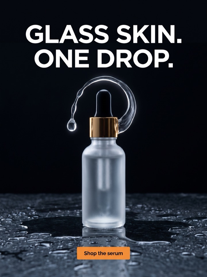
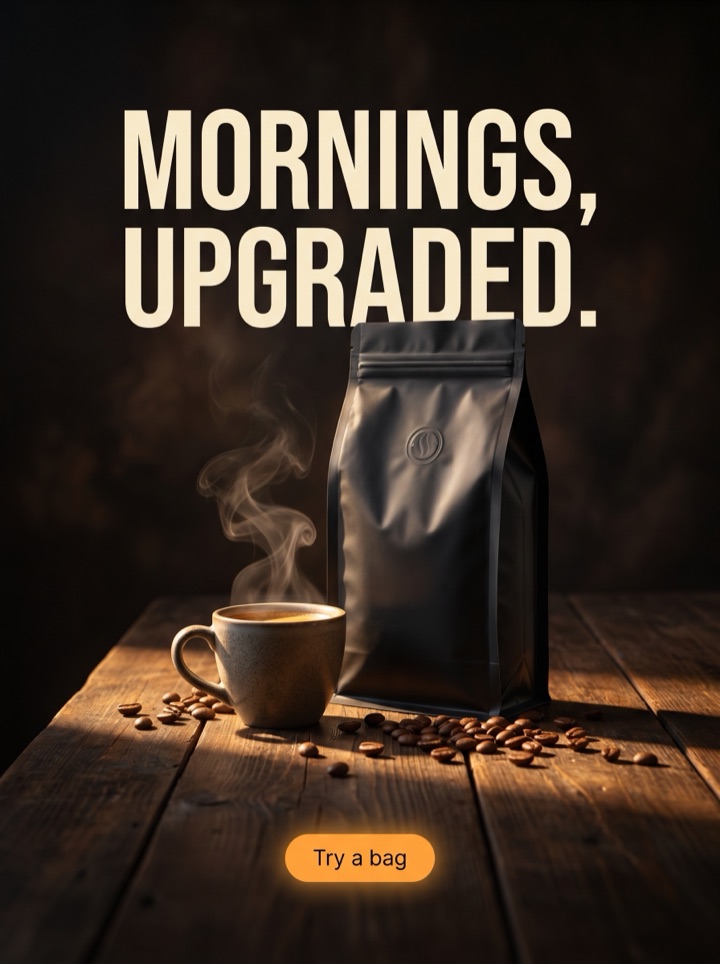
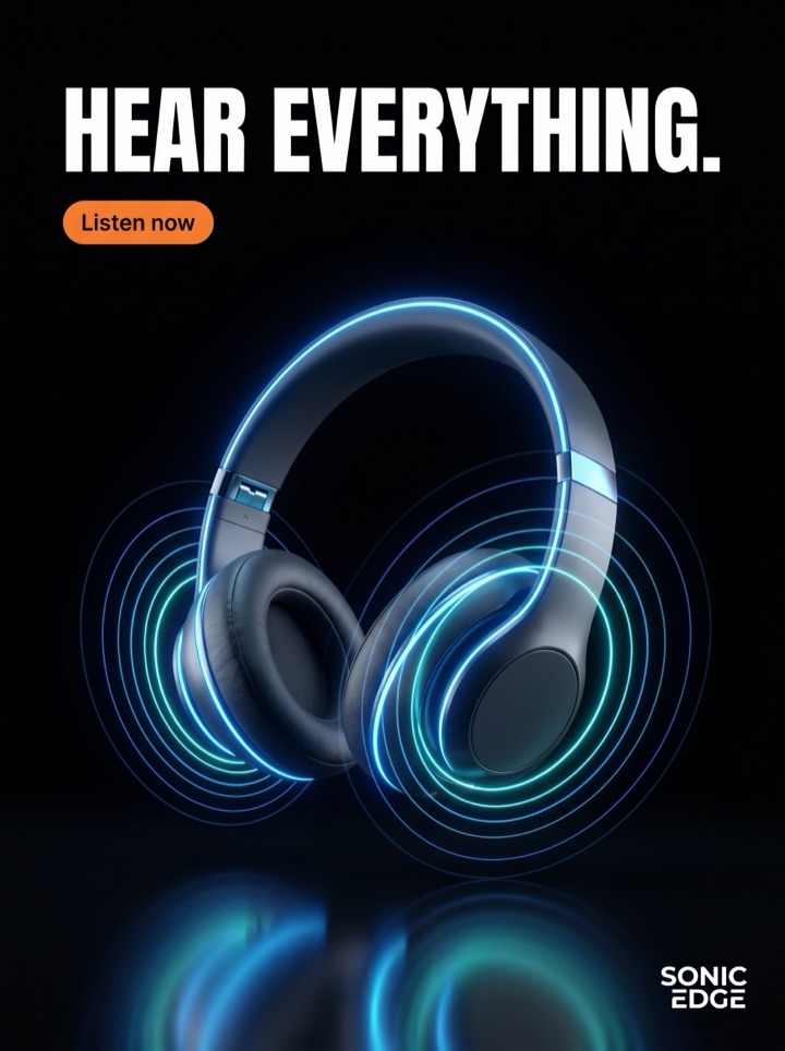
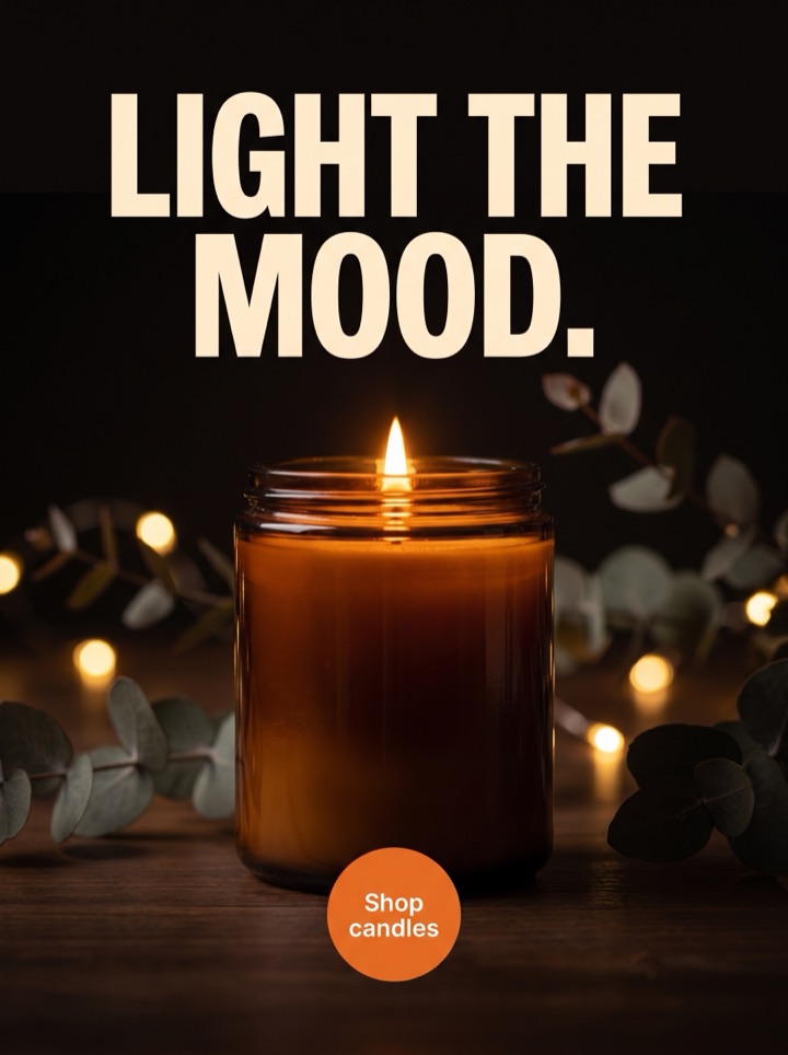
Premium Product ad generator examples
The premium angle wins on restraint. Every example below leads with the product and one quiet claim of quality, with no discount badge fighting for attention. Notice how much each layout leaves empty on purpose.


Campaign brief
How to brief a premium-angle ad
The premium angle is a positioning decision before it is a design one. You are telling the shopper this product is worth its price because of how it is made, where it comes from, or how it feels to own. These notes keep the creative from drifting back into a sale ad.
When to pick this angle
Reach for premium when the price is the objection and the discount is not an option. It fits considered purchases — jewelry, fragrance, leather goods, skincare, small-batch food — where buyers want to feel the choice was tasteful, not thrifty.
The one detail to lead with
Premium ads earn trust through a single believable proof of quality: hand-stitched, single-origin, solid brass, 24-hour cure. Pick the most concrete one and let the photo show it. Vague words like "luxury" or "best" do the opposite of the angle.
What to leave out
No countdown, no strikethrough price, no "50% off today." A premium poster says less. The discipline of removing the urgency cues is most of what makes the angle read as premium at a glance.
Tone and typeface
Calm, declarative, a little understated. A serif headline, tight tracking, and one supporting line usually outperform a punchy promotional voice here. The CTA invites rather than pressures: Discover, Explore, See the craft.
Color and space
Restraint reads as expense. Wide margins, a muted or monochrome palette, and a single accent color signal premium faster than any adjective. If the layout feels a touch empty, you are probably close.
The honesty check
The premium claim has to be true on the product page too. If the ad promises craftsmanship the listing cannot back up, the angle erodes trust instead of building it. Only claim quality you can show.
How it works
Building a premium-angle poster, step by step.
1
Upload the most detailed shot
Choose the photo where the material, finish, or texture is easiest to see. The premium angle lives in the close-up detail, so pick the frame that makes the product look made by hand, not mass-produced.
2
Set the angle to premium
The generator drops the discount badges and urgency copy, opens up the margins, and reaches for serif headlines and a muted palette — the layout grammar that reads as quality rather than as a sale.
3
Write one quiet claim
Replace the placeholder headline with a single concrete proof of craft, and keep the supporting line to one sentence. Less copy is the whole point of this angle.
4
Preview, then export the calm one
Review the view-only options and unlock the version that feels confident and uncluttered. Export it high-res in 1:1 and 4:5 so it holds its composure in feed.
Examples
Premium-angle ad examples
Premium is one position in a wider test. The most useful first experiment is premium versus an angle that pulls the other way — usually a price or urgency play — so you learn whether your audience buys on aspiration or on a deal.
Field notes
Field notes on running the premium angle
Hard-won specifics for the premium angle — the small judgment calls that decide whether a poster reads as expensive or just plain.
Creative review
- If you can see the brush of light on a surface or the grain of a material, the premium angle is working. Sharp, real texture is the single strongest signal of quality you have.
- Cut one word from the headline, then cut one more. Premium copy is short and certain. The moment it starts explaining or persuading, it slips back into a regular sales ad.
- Let the product be the only character on screen. Props, lifestyle clutter, and busy backgrounds dilute the angle; an object alone in space looks considered.
- Set the brand name small. A logo shouting at the top of the frame reads as a discount retailer; a quiet wordmark at the base reads as a house that does not need to.
Placement review
- Run premium against a price or urgency ad for the same product. That single A/B tells you whether the audience is buying the story or hunting for a deal — and it changes your whole funnel.
- Premium often has a lower click rate but a higher-quality click. Judge it on add-to-cart and return rate, not raw CTR, or you will kill the angle for the wrong reason.
- Watch the comments and replies, not just the dashboard. Premium creative that lands tends to pull "where is this from" rather than "is this on sale."
Export review
- Shrink the poster to a thumbnail. If the product still looks expensive at feed size with the copy unreadable, the composition is doing the work. If it collapses, the words were carrying it.
- Confirm the craft claim is true and shown, not just stated. "Hand-finished" with a visible seam beats "premium quality" floating over a stock shot every time.
- Make sure no urgency cue snuck back in — a leftover badge, an exclamation point, a "shop now." One promotional artifact can undo the entire premium read.
Sizes and exports
Premium-angle sizes and exports
The premium angle leans on space, so the aspect ratio you choose matters more than usual. Static posters export first; display and HTML5 formats stay clearly labeled as agency or roadmap workflows until they are enabled.
1:1 square
The safest home for a premium poster: the symmetry lets you center the product with even margins on all sides, which is exactly the balanced, unhurried look the angle wants.
4:5 feed
The extra height buys you breathing room above and below the product — ideal when a serif headline and a single quiet line need air to feel deliberate rather than cramped.
9:16 story/reels
Full-screen vertical suits an editorial premium look: product high in the frame, generous empty lower third, brand mark resting calmly at the base.
Facebook feed
Check the premium crop at desktop feed width too. Thin accent type and pale palettes that look elegant on a phone can wash out on a larger, brighter screen.
Premium creative usually means a stylist, a photographer, and a designer who all understand restraint. Product AdKit gives a solo founder the same grammar — wide margins, serif type, no discount noise — from a single product photo, so you can test whether quality-led ads move your buyer before you commit a budget to them.
Copy examples
Premium-angle hooks, CTAs, and the mistakes to avoid.
Headline hooks
- Made to be kept.
- The detail you only notice up close.
- Quietly, the better one.
- Worth the wait, not the discount.
- Built once, properly.
- The version that outlasts the trend.
- You can feel where it was finished by hand.
- No sale. Just better.
CTA examples
- Discover the piece
- See the craft
- Explore the detail
- Meet the maker
- View the collection
Common mistakes
- Slapping a percent-off badge on a premium layout — the discount cue cancels the entire angle in a single glance.
- Writing "luxury," "premium," or "high quality" instead of showing one concrete proof of craft the eye can verify.
- Crowding the frame with props and lifestyle clutter when the angle depends on the product standing alone in space.
- Judging the angle on raw CTR and killing it early, instead of on add-to-cart, basket size, and return rate.
- Promising craftsmanship the product page cannot back up, so the premium claim erodes trust on arrival.
Examples
Premium-angle ad examples
Run a premium poster through this before it goes live. It is the human pass that keeps "premium" from quietly turning back into "on sale."
1
Is there exactly one concrete proof of quality on screen — a material, a finish, an origin — that the photo can actually show?
2
Have all urgency and discount cues been removed: no badge, no countdown, no strikethrough price, no "shop now"?
3
Does the layout breathe, with wide margins and the product as the only object the eye has to land on?
4
At thumbnail size, does the product still look expensive even when the copy is too small to read?
5
Can the product page honestly back up the craft claim the ad is making?
FAQ
Premium Product ad generator questions
What makes a premium ad angle different from a regular product ad?
The premium angle sells on quality, craft, and aspiration instead of price. It uses restraint: more negative space, a calm headline, no discount badge, and a CTA that reads like an invitation rather than a sale. The job is to make the product feel worth more, not cheaper.
Can I run a premium angle ad without a discount or sale?
Yes, and you usually should. A premium poster leads with the material, finish, or origin detail and lets the price stand on its own. Adding a percent-off badge undercuts the whole angle, so the generator keeps premium layouts deliberately offer-light.
What kind of product photo works for a premium ad angle?
A clean, well-lit shot with real texture you can see: grain, stitching, glass, metal, weave. Premium reads as believable detail. Avoid busy backgrounds and heavy props so the product, generous margins, and one short line of copy can carry the frame.
Can I edit and export a premium angle poster without a watermark?
The headline, the single supporting line, type pairing, color, and crop are baked into each finished poster — steer them up front and regenerate until the restraint reads right before you pay. Free previews are view-only; paid packs unlock high-res, no-watermark exports and ZIP downloads in Meta sizes.
Related tools