Instagram Square ad maker
Instagram Square ad maker
The Instagram square has one tell: a 1080x1080 tile that looks like a resized banner gets scrolled past, while one that looks deliberate gets read. Upload a single product photo and get back a pack of 1:1 posters built to sit native beside organic feed posts — product centered, headline and CTA living inside the square instead of clinging to an edge. Steer the offer and direction up front, then make more like the squares that stop the thumb.
Your free preview is one full-quality 1:1 square rendered by the real engine — no watermark, no credit card, view-only at 2K so you can judge whether the product centers and the CTA reads before you spend. The $29 pack unlocks all 10 concepts, every Meta size, 4K no-watermark PNG/JPG, and a ZIP download. Only QA-passed ads are charged; if fewer than 12 pass, the difference auto-refunds, and ads never expire.
Examples
Instagram Square ad maker examples
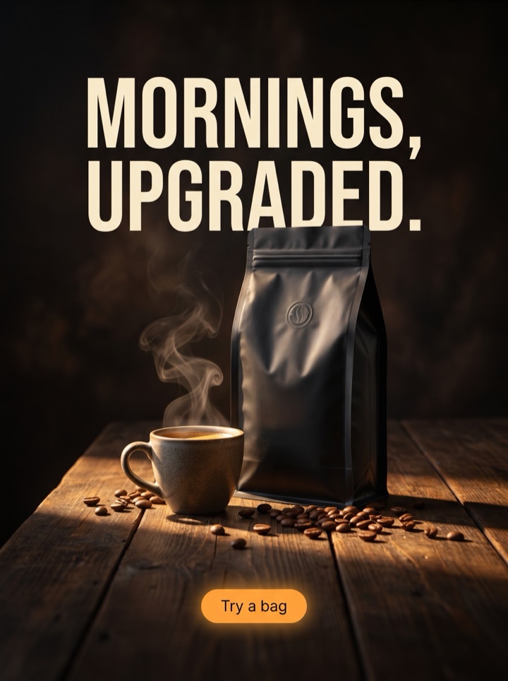
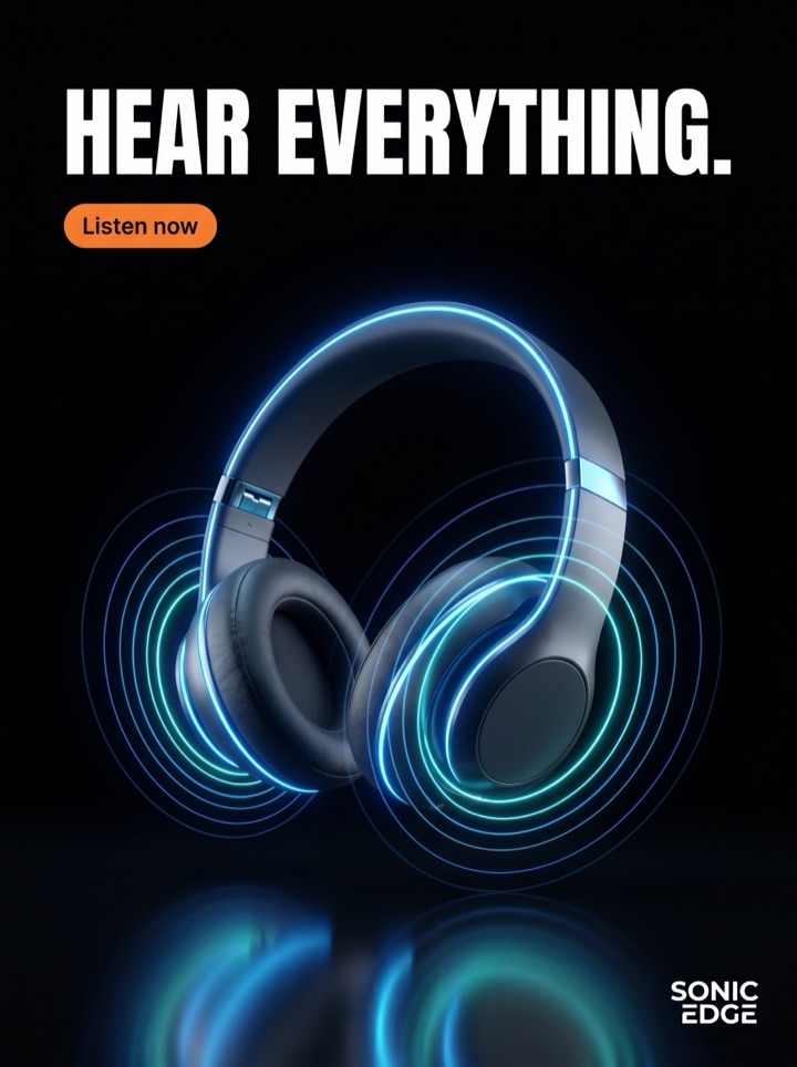
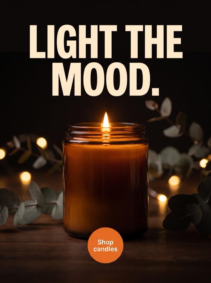
Every square below comes from the same single product photo, recut into a different reason to tap — and every one is laid out for the 1:1 crop, where there's no caption above the fold to lean on and the four corners are the first thing the eye discards. The job of a feed-native square is to put the product dead-center, keep the headline off the edges, and land the CTA inside the frame without making the tile feel like a coupon dropped into your feed.



Campaign brief
Instagram Square Ad Maker campaign brief
A useful instagram square creatives page should help the visitor decide whether an Instagram square frame where product detail has to feel native beside organic posts fits the product story. Use these notes to test the frame, not just the dimension.
Best use
Reach for the square when you need a feed-native control creative — the 1:1 tile is the one that has to look deliberate beside organic Instagram posts, not like a display banner squeezed into a social slot. A pack hands you several centered, in-frame layouts to compare instead of one square you hope lands.
Asset to upload
One clean, centered product photo with texture or packaging detail that still reads in a compact feed tile. The square crop is unforgiving at thumbnail size, so a clear silhouette and a detail worth seeing beat a busy lifestyle scene the crop will mangle.
First test
Pit a clean product square against a proof-led square carrying a review or founder quote. Keep the offer and the crop identical so the test tells you whether your feed audience trusts the product shot or the social proof — not which layout happened to crop better.
Format choice
Export the 1:1 square first when the campaign needs a polished, feed-native product tile. It's the dependable control; add 4:5 feed for the vertical room and 9:16 story for full-screen once the square proves the hook. The square is what reads native in-grid.
Copy direction
Steer toward a short headline and a direct CTA that can sit naturally inside the square. Name the offer or the product detail up front in your direction notes — text is baked into each poster, so the line you set is the line that ships, centered and clear of the corners.
How it works
Build Instagram Square Ad Maker creative around the frame.
1
Upload the product
One clean, centered photo with the detail that matters visible. This single shot feeds every 1:1 square in the pack, so shoot it in even light with the silhouette clear and room to breathe around the product.
2
Steer the square
Set the direction up front — clean product, proof-led, offer-led, new arrival — plus the offer and any short line you want centered in the tile. Text is baked into each poster, so this is where you shape the headline and CTA, not a later canvas edit.
3
Review at feed size
Your free preview comes back as one full-quality square in a few minutes — view it at thumbnail scale, mark the layouts that read native in-grid, and make more like the winners. Kill any tile where copy hugs the corners or the CTA crowds the product.
4
Export the runners
Unlock the $29 pack for all 10 concepts in every Meta size — 1:1 first, plus 4:5 feed and 9:16 story — as 4K no-watermark files in a ZIP. Only QA-passed ads are charged; under 12 auto-refunds the difference, and nothing expires.
Ad angles included
Ad angles for Instagram Square ad maker
The Instagram square is the placement people assume is easy and get wrong most. A 1080x1080 tile sits in the grid next to organic posts, so it has to look like a deliberate feed creative — not a banner resized down to fit. That means the product anchors the center, the headline works without the caption above it, and the CTA lives inside the frame where the corners get cropped or ignored. A pack lets you compare clean, proof-led, and offer-led squares side by side before any spend, instead of betting the campaign on one tile.
Field notes
Instagram Square Ad Maker field notes
These field notes are a quick human quality pass for instagram square creatives and an Instagram square frame where product detail has to feel native beside organic posts before you turn previews into production ads.
Creative review
- First check on any square: does the product still read as the product at thumbnail size? The 1:1 tile is tiny in-grid, so if the silhouette mushes at 150 pixels you have a color swatch, not a product ad.
- Center the product and keep copy off the four corners — the square crop and rounded-feed rendering eat the corners first, so a headline or badge jammed into a corner is a headline you'll lose.
- A feed-native square doesn't look like a coupon. The CTA should sit inside the frame and feel like part of the composition; a loud button stapled to the edge is what makes the tile read as an ad to skip.
- The square has no caption above the fold to lean on — the headline has to carry the hook on its own. 'Just dropped' or a named detail works; a line that only makes sense with the post text below it doesn't.
Placement review
- Proof travels well in the square: a one-line quote or a star-row centered under the product out-pulls a generic benefit line, because social proof in a social feed reads native.
- 1080x1080 is the spec to design to — it's the resolution Instagram serves the feed tile at, and the pack ships the square at that and up so it stays crisp on retina screens.
- Balance beats density in a 1:1 frame. Product center, one line above, CTA below, corners empty — the tile that breathes reads as deliberate; the one packed corner-to-corner reads as a banner.
Export review
- Run the square as your control and let 4:5 and 9:16 be the variants — the 1:1 is the one that has to hold up natively in the grid, so prove the hook there first.
- Check the colorway against your product page before export: a square that warms the product is advertising a slightly different item, and the feed shows it next to the real thing in your organic posts.
Sizes and exports
Sizes and exports for Instagram Square ad maker
For instagram square creatives, the export shape should support the product story. Static posters are available first; display and HTML5 exports stay clearly labeled as agency or roadmap workflows until enabled.
1:1 square
Use 1:1 square when the instagram square creatives concept needs a balanced product, hook, and CTA layout.
4:5 feed
Use 4:5 feed when the product in instagram square creatives needs more vertical room than a square ad but still appears in feed.
9:16 story/reels
Use 9:16 story/reels for full-screen mobile placements where the product and CTA for instagram square creatives need strong top-to-bottom spacing.
Facebook feed
Use Facebook feed when the product in instagram square creatives needs more vertical room than a square ad but still appears in feed.
Instagram Square Ad Maker pages should help a founder decide what to make next: which product image to use, which hook to test, which placement to export, and what should stay locked behind a paid pack. That is why Product AdKit centers the product workflow instead of offering a generic design surface.
Copy examples
Hooks, CTAs, and mistakes for Instagram Square ad maker.
Headline hooks
- Just dropped. Live in the feed today.
- The square your grid has been missing.
- Centered, clean, and it actually sells.
- Tap once. The product does the rest.
- Proof in the post, not just the caption.
- 20% off, today only — read the badge.
- Looks native. Converts like a paid ad.
- One photo. Ten squares. Pick your winner.
CTA examples
- Generate this size
- Preview the format
- Export the pack
- Check the layout
- Start from a product photo
Common mistakes
- Designing a banner and squeezing it into the square — a resized leaderboard reads as an ad to skip the moment it lands next to organic posts.
- Pushing the headline or offer badge into a corner, where the feed crop and rounded rendering clip it.
- Letting the CTA fight the product for the center instead of sitting inside the frame as part of the lockup.
- Writing a headline that only makes sense with the caption below it — the square has no caption above the fold to carry the hook.
- Packing the 1:1 frame corner-to-corner so nothing breathes and the tile reads as a coupon, not a feed creative.
Editorial review
Instagram Square Ad Maker review checklist
Use this instagram square creatives checklist as a human quality pass before turning previews into production ads.
1
Does the product still read as the product at thumbnail size after the 1:1 crop?
2
Is all copy inside the frame and clear of the four corners, where the feed crop clips?
3
Does the CTA sit inside the square as part of the lockup instead of fighting the product for the center?
4
Does the headline carry the hook on its own, without a caption above the fold to explain it?
5
Does the tile look like a deliberate feed creative beside organic posts, not a resized banner?
FAQ
Instagram Square ad maker questions
What size should an Instagram square ad be, and what does the pack export?
Design to 1080x1080 — that's the resolution Instagram serves the square feed tile at, and it's the standard for a 1:1 ad. The pack renders the square at that and up, exporting 4K no-watermark PNG/JPG so the tile stays crisp on retina phones. The free preview is a full-quality 2K square, view-only; the $29 pack unlocks the high-res download in a ZIP.
Where does text sit safely in a 1:1 square without getting cropped?
Keep copy inside the frame and off the four corners — the square crop and rounded feed rendering discard the corners first, so a badge or headline jammed into one is the first thing you lose. The reliable layout is product centered, a short headline above it, and the CTA inside the bottom third. The generator bakes the text into that centered safe zone for you, so the line you steer is the line that ships clear of the edges.
Do I need every Meta size, or is the square enough?
The square is the right control to start with — it's the one that has to read native in the Instagram grid beside organic posts. Many campaigns run the 1:1 alone at first, then add 4:5 feed for vertical room and 9:16 story for full-screen once the square proves the hook. All sizes come in the $29 pack from the same photo, so you can export the square first and grab the others only when your spend lands there.
How much headline can a square actually carry before it stops reading native?
Less than you'd think. The 1:1 tile is small in-grid and has no caption above the fold to lean on, so the headline has to land in one short line that survives at thumbnail size. One hook plus a direct CTA reads as a deliberate feed creative; three stacked claims around the product read as a banner. Steer toward a single centered line — text is baked in, so you regenerate rather than trim it later.
Related tools