300x600 Half-Page ad maker
300x600 Half-Page ad maker
The 300x600 half-page is the rare display slot with real vertical room — a tall sidebar column where you can actually tell a story: product up top, headline, one proof point, CTA at the base, in that reading order. Upload one product photo and get back a pack of static half-page concepts that use the height to build a hierarchy, not just to stretch background. The catch is the same room that lets you explain also lets you clutter, so the angles that win are the ones that earn every inch.
Free previews are full-quality and view-only — one clean 2K concept rendered by the real engine, no watermark and no credit card, so you can judge whether the vertical product-to-CTA scan actually holds before you spend. The $29 pack unlocks all 10 concepts in every Meta size, plus 4K no-watermark PNG/JPG and a ZIP download. Only QA-passed ads are charged; under 12 pass and the difference auto-refunds.
Examples
300x600 Half-Page ad maker examples
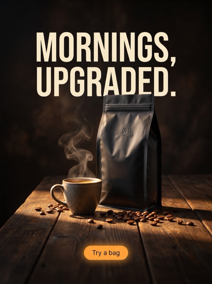
Every concept below is a static half-page poster built from the same single product photo, each one using the 300x600 column differently. These are sized for the half-page slot, not animated HTML5 banners — animated export isn't live yet. What changes between them is how the tall frame is divided: where the product sits, how many proof points the height carries, and how far down the CTA lands before it falls off a typical viewport.





Campaign brief
300x600 Half Page Ad Maker campaign brief
A useful 300x600 half page creatives page should help the visitor decide whether a tall half-page display unit with room for product storytelling and a stronger visual hierarchy fits the product story. Use these notes to test the frame, not just the dimension.
Best use
Reach for the half-page when a compact rectangle can't hold the explanation — a product that needs a proof point and an offer, not just a logo and a button. The 300x600 column has room for a real top-to-bottom story, so the pack gives you several ways to divide that height instead of one guess at the lockup.
Asset to upload
One clean product photo with a clear silhouette that can anchor the upper or middle of a narrow vertical column. The unit is only 300px wide, so busy backgrounds and fine packaging text get lost — give the generator a shot where the product reads at sidebar scale.
First test
Run a premium half-page (product up top, lots of breathing room, one headline) against a direct-offer half-page (discount badge, price, harder CTA) on the same crop. The height stays constant; you're testing whether your buyers respond to story or to offer in the sidebar slot.
Copy direction
Steer the vertical order before you generate: headline, the one proof line, CTA, and the sequence down the column. Text is baked into each poster, so the stacking you describe is what ships. These are static concepts sized for the slot — animated or HTML5 ZIP export is roadmap, not live — so pair the half-page with the square and 4:5 sizes in the pack to carry one story across feed and display.
Human review
Check the bottom third hardest. Half-page units often render in a sidebar where the lower portion sits below the fold, so confirm the CTA and any price line aren't stranded at the very base. If the whole pitch needs the full 600px to land, that's a layout to regenerate tighter.
How it works
Build 300x600 Half Page Ad Maker creative around the frame.
1
Upload the product
One clean shot with a clear silhouette that holds up at 300px wide. This single photo feeds every half-page angle, so pick one where the product still reads in a narrow sidebar column.
2
Steer the vertical story
Set the top-to-bottom order — product zone, headline, proof line, CTA — plus the offer you want carried. Text is baked into each poster, so the sequence you describe here is the sequence the half-page ships with.
3
Review the stack
A free, full-quality preview comes back in a few minutes, view-only and no watermark. Check that the eye travels product to proof to CTA and that nothing important hides in the bottom third, then regenerate the angles worth running.
4
Export the runners
Unlock the $29 pack for 4K, no-watermark files and the ZIP — all 10 concepts in every Meta size, the half-page included. Only QA-passed ads are charged, and under 12 auto-refunds the difference.
Ad angles included
Ad angles for 300x600 Half-Page ad maker
The 300x600 half-page earns its name twice over: it's a half-page of real estate and a half-column of story room most display sizes don't give you. That height is the whole reason to use it — enough vertical space to stack a product, a headline, one proof point, and a CTA in a clean reading order. A pack lets you compare ways to divide that column — premium and airy versus dense and offer-led — before you commit spend to a single lockup. These are static concepts sized for the slot, not animated banners; animated HTML5 export is roadmap, not live.
Field notes
300x600 Half Page Ad Maker field notes
These field notes are a quick human quality pass for 300x600 half page creatives and a tall half-page display unit with room for product storytelling and a stronger visual hierarchy before you turn previews into production ads.
Creative review
- The half-page lives or dies on vertical hierarchy: product, then headline, then proof, then CTA, in that order down the column. If the eye doesn't travel cleanly top to bottom, the extra height worked against you.
- 300px wide is narrower than it feels. Long headlines wrap into walls of text and fine packaging copy turns to mush — keep lines short and let the height, not the width, carry the message.
- Treat the bottom third as below the fold by default. Many sidebar half-pages get cut off in a real viewport, so the CTA and any price should land where they still show, not at the very base.
- Whitespace is the half-page's whole premium trick, but empty isn't the same as airy. Negative space that frames the product reads expensive; a giant gap with the product shoved to one edge just reads unfinished.
Placement review
- One proof point, not five. The roomy column tempts you to list every benefit; the version that wins usually picks the single strongest reason and gives it space.
- The half-page and the leaderboard are opposite problems. Where 728x90 forces you to cut, 300x600 tempts you to pile on — discipline is the skill in both, just pointed different directions.
- A vertical bundle reads naturally here: stack two products with a 'build the set' line between them. The column shape does the storytelling a square can't.
Export review
- Check the product silhouette at the real rendered size, not in the editor. If it shrinks to a logo-like mark in a sidebar, the concept needs a tighter, larger product crop.
- Same product story, different size: the half-page that wins should share its hook with your 1:1 and 4:5 concepts so the campaign feels like one voice across feed and display.
Sizes and exports
Sizes and exports for 300x600 Half-Page ad maker
For 300x600 half page creatives, the export shape should support the product story. Static posters are available first; display and HTML5 exports stay clearly labeled as agency or roadmap workflows until enabled.
300x600 half-page
Use 300x600 half-page for a tall display concept with room for product, benefit, offer, and button.
300x250 display
Use 300x250 display for compact display inventory where the product image and offer for 300x600 half page creatives must read at small size.
336x280 large rectangle
Use 336x280 large rectangle for compact display inventory where the product image and offer for 300x600 half page creatives must read at small size.
728x90 leaderboard
Use 728x90 leaderboard when the product needs a wide lockup with a short hook and one CTA.
320x50 mobile
Use 320x50 mobile for 300x600 half page creatives only when the hook is short and the product silhouette is instantly recognizable.
970x250 billboard
Use 970x250 billboard when the product needs a wide lockup with a short hook and one CTA.
300x600 Half Page Ad Maker pages should help a founder decide what to make next: which product image to use, which hook to test, which placement to export, and what should stay locked behind a paid pack. That is why Product AdKit centers the product workflow instead of offering a generic design surface.
Copy examples
Hooks, CTAs, and mistakes for 300x600 Half-Page ad maker.
Headline hooks
- The full story, top to bottom. No scroll required.
- Product up top. Proof in the middle. Reason to click at the base.
- A sidebar slot with room to actually explain.
- One product, one promise, one button — stacked clean.
- Built for the column, not squeezed into it.
- The half-page that reads before it's fully on screen.
- Tall enough to tell it. Tight enough to land it.
- Stack the set. Save on the bundle. Tap to shop.
CTA examples
- Generate this size
- Preview the format
- Export the pack
- Check the layout
- Start from a product photo
Common mistakes
- Pouring every benefit into the column because it looks roomy — the half-page rewards one strong proof point, not a list.
- Letting the CTA or price live in the bottom third where a sidebar viewport cuts it off before anyone sees it.
- Writing headlines for the width you wish you had — at 300px they wrap into a text wall and bury the product.
- Confusing empty space for premium space: a product shoved to one edge with a dead gap reads unfinished, not expensive.
- Expecting an animated or HTML5 banner — these are static half-page concepts; motion export isn't live yet.
Editorial review
300x600 Half Page Ad Maker review checklist
Use this 300x600 half page creatives checklist as a human quality pass before turning previews into production ads.
1
Does the eye travel cleanly product to headline to proof to CTA down the column?
2
Are the CTA and any price above the bottom third, where a sidebar viewport still shows them?
3
Does the headline stay short enough to avoid wrapping into a wall at 300px wide?
4
Does the half-page carry one strong proof point instead of a list of every benefit?
5
Does the hook match your square and 4:5 concepts so the campaign reads as one brand?
FAQ
300x600 Half-Page ad maker questions
What's the safe area on a 300x600 half-page, and where should the CTA sit?
Build for the column to read top to bottom — product in the upper or middle zone, headline and one proof line below it. The riskiest band is the bottom third: half-page units often render in a sidebar where the lower portion sits below the fold. Keep the CTA and any price line above that, roughly in the lower-middle, so they show even when the full 600px isn't visible.
What pixel size should I use for a half-page ad?
300 by 600 pixels is the standard half-page (also called a large skyscraper). The pack renders at high resolution so the file stays crisp when the network serves it down to placement size. The constraint that bites isn't resolution — it's the narrow 300px width, which is why short headlines and a clear product silhouette matter more than raw pixels here.
How much text can a 300x600 concept actually carry?
More than a compact rectangle, less than the height suggests. The column has room for a headline, one proof point, and a CTA stacked cleanly — that's the sweet spot. Push past that into multiple claims and the narrow width turns it into a wall of small type. Because text is baked into each poster, you set that vertical order up front and regenerate rather than editing it after.
Do I need the half-page if I already have square and feed ads?
Only if you're buying display sidebar inventory — the 300x600 is a display unit, not a Meta feed size. If your spend is feed-only, the square and 4:5 concepts carry it. The $29 pack includes every size, so the half-page is there when you expand into display; just keep its hook consistent with your feed ads. Note these are static concepts — animated banner export is roadmap, not live.
Related tools