minimal product ad generator
Minimal Product ad generator
Turn one product photo into clean, product-first ad variations, lots of negative space, one short line, one CTA, ready to test on Facebook and Instagram.
Free minimal previews are full-quality and view-only so you can judge the composition first. Unlock the full pack only once the clean layout reads at a glance, then export high-res, no-watermark files, ZIP download, and Meta sizes.
Examples
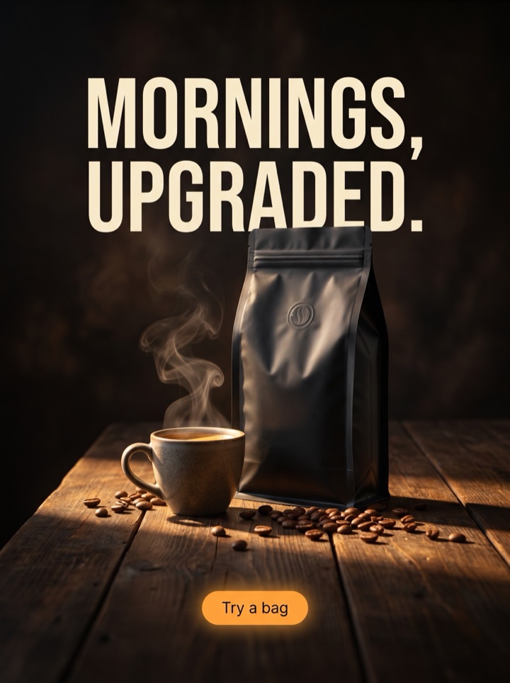
Minimal Product ad generator examples
The minimal angle wins by subtraction: one product, one short line, one CTA, and a lot of quiet space around it. Every example below removes something a busier ad would keep, so the product carries the click.


Campaign brief
Minimal Product Ad Generator campaign brief
Minimal is a discipline, not a default. The brief below is about what to leave out so the product and one line do the work. Use it to brief a clean ad you would actually run.
When the angle fits
The minimal angle fits recognizable products, premium positioning, and clean packaging that can carry the frame alone. If the buyer needs convincing with proof or a discount, a louder angle usually beats it.
Photo that holds it up
A minimal ad lives or dies on the photo. Use a sharp, well-lit product shot on a plain or tonal background with real room around the product. Busy, cluttered photos cannot be rescued by a clean layout.
The one line
Pick a single short line, three to six words, that only this product could say. If the headline would fit any brand, the minimal angle will read as generic and the empty space will look like a missing element.
Negative space on purpose
Reserve roughly half the frame for nothing. The product sits in the lower or off-center area, the line breathes, and a single CTA closes it. Resist the urge to fill the gap with a badge.
One CTA, no extras
Minimal ads use one quiet CTA and nothing else, no price tag, no star rating, no second offer. Each thing you add pulls the ad toward a different angle and away from the clean read.
The squint test
Before publishing, squint at the ad. You should still see the product and one line clearly. If your eye does not know where to land, the layout is not minimal yet, it is just sparse.
How it works
Build a minimal ad by deciding what to take out.
1
Lead with the photo
Upload the cleanest product shot you have, with room around it. The minimal angle starts from the image, so the photo, not the copy, is the first decision.
2
Cut to one line
Generate clean layouts and keep only the single line that earns its space. Delete the supporting copy, the second benefit, and any badge before you commit.
3
Preview the quiet pack
Review the view-only minimal previews and check the composition at phone size, not just the headline. A clean ad has to survive the small placement.
4
Export when it reads
Unlock high-res files once the product and one CTA still read at a glance. If you had to add elements to make it work, it stopped being a minimal ad.
Examples
Minimal Product ad generator examples
Minimal rarely wins in a vacuum. The clean angle earns its place when you run it beside a flash sale, social-proof, or launch version and watch which one the audience actually clicks. Use these as the controls.
Field notes
Minimal Product Ad Generator field notes
Hard-won notes on running the minimal angle. The recurring failure mode is an ad that looks clean in the editor and disappears in the feed, so most of this is about defending the read.
Creative review
- Let the product be the hero. In a minimal ad the photo is the argument, so it should occupy the eye before the headline does, not share the frame with graphics.
- Treat negative space as a design element you chose, not a leftover. Align the product and the line to the space so the balance looks deliberate.
- Match the background tone to the product or packaging rather than defaulting to stark white. A soft tonal field reads more premium and hides fewer product edges.
- One typeface, one weight, one size of headline. The moment a minimal ad has two type treatments, it starts to look busy again.
Placement review
- Check the ad at phone width before you fall in love with it. Thin, elegant type that sings on desktop often vanishes in a scrolling feed.
- Minimal can read as a placeholder to a fast-scrolling shopper. Make sure the product is instantly recognizable so the quiet does not register as a blank ad.
- If the product is unfamiliar or the audience is cold, pair the minimal ad with a proof or offer version in the same test. Cold traffic often needs a louder reason than minimal gives.
Export review
- Every time you want to add a badge, a price, or a second line, ask whether it belongs on a different angle. Usually it does, and adding it here breaks the minimal read.
- A minimal ad is worth exporting when removing any one element would weaken it. If you can still cut something, cut it before you pay.
- Keep the claim true. A clean, confident frame raises expectations, so the product page has to deliver the quality the ad implies.
Sizes and exports
Sizes and exports for Minimal Product ad generator
Minimal ads are forgiving to crop because there is so little to protect, but the negative space still has to land. Static posters export first; display and HTML5 stay clearly labeled as roadmap workflows until they ship.
1:1 square
The square is the cleanest home for a minimal ad. Center the product, give the line room above or below, and let the symmetry do the work.
4:5 feed
The extra height in 4:5 buys you more negative space to stack the product and one line vertically. Keep the CTA low and uncrowded.
9:16 story/reels
Full-screen story is where minimal shines: float the product in the middle third and leave the top and bottom almost empty. Mind the safe zones.
Facebook feed
In the Facebook feed a quiet ad sits between busy ones, so the contrast can help. Confirm the thin type still holds up at feed scale before export.
Anyone can leave white space, but a minimal ad that actually converts needs the product anchored, the line cut to the bone, and the CTA quiet but obvious. Product AdKit drafts that balance from your photo so you start from a clean ad, not an empty artboard wondering what to delete.
Copy examples
Hooks, CTAs, and mistakes for the minimal angle.
Headline hooks
- Just the product. Nothing else.
- Less ad. More product.
- The whole pitch in three words.
- It speaks for itself.
- No badges. No hype. Just this.
- One product. One reason. One tap.
- Designed to be ignored by nobody.
- What it is, on a clean white page.
CTA examples
- See it
- Shop now
- Take a look
- Get yours
- View product
Common mistakes
- Confusing minimal with empty: leaving space but giving the eye no product or line to land on.
- Sneaking a price tag, star rating, or second offer back in until the ad is no longer minimal.
- Using a cluttered or busy product photo and expecting a clean layout to fix it.
- Running thin, elegant type that looks great in the editor and disappears in a phone-size feed.
- Choosing minimal for cold traffic or an unknown product, where the buyer needed proof or urgency instead.
Examples
Minimal Product ad generator examples
Run a clean ad through these five questions before you export. If any answer is no, the angle is not minimal yet.
1
Is the product the first thing your eye lands on, ahead of the headline and any graphics?
2
Is the copy down to one short line that only this product could honestly say?
3
Would removing any single element on the frame make the ad weaker, not cleaner?
4
At phone size, does the product still read instantly so the quiet does not look like a blank ad?
5
Does the clean, premium frame match a product page that can deliver on that impression?
FAQ
Minimal Product ad generator questions
What makes a product ad feel minimal instead of empty?
A minimal ad still has one clear job: show the product and give one reason to click. The negative space is intentional, the type is short, and there is a single CTA. Empty means the space carries no product, hook, or offer. Product AdKit drafts the minimal layout with the product anchored and one line of copy, so the restraint reads as confidence, not a missing element.
Does a minimal ad angle actually convert, or just look nice?
Minimal works when the product is recognizable or the brand is premium, because a clean frame signals quality and lets the product be the hook. It tends to lose to a louder angle when the buyer needs proof or urgency. Run a minimal version against a social-proof or offer-led control so you can see which the audience actually responds to.
How much copy should a minimal product ad have?
One short line, ideally three to six words, plus a single CTA. If you need a second line, the angle is probably not minimal, it is benefit-led. You steer the headline, CTA, and color direction up front — ask for fewer words and regenerate until only the strongest line remains before paid export.
Can I export minimal product ads without a watermark?
Free minimal previews are full-quality and view-only so you can judge the composition first. Paid packs unlock high-res, no-watermark exports in Meta square, feed, and story sizes, plus ZIP download for the set.
Related tools