comparison ad generator
Comparison ad generator
Turn one product photo into side-by-side comparison ads — this vs. that, old way vs. new way — for Facebook, Instagram, and paid social testing.
Free comparison ad previews are full-quality and view-only. Unlock the full pack only once a split-frame concept clearly reads — then export high-res files, no-watermark assets, ZIP download, and Meta sizes.
Examples
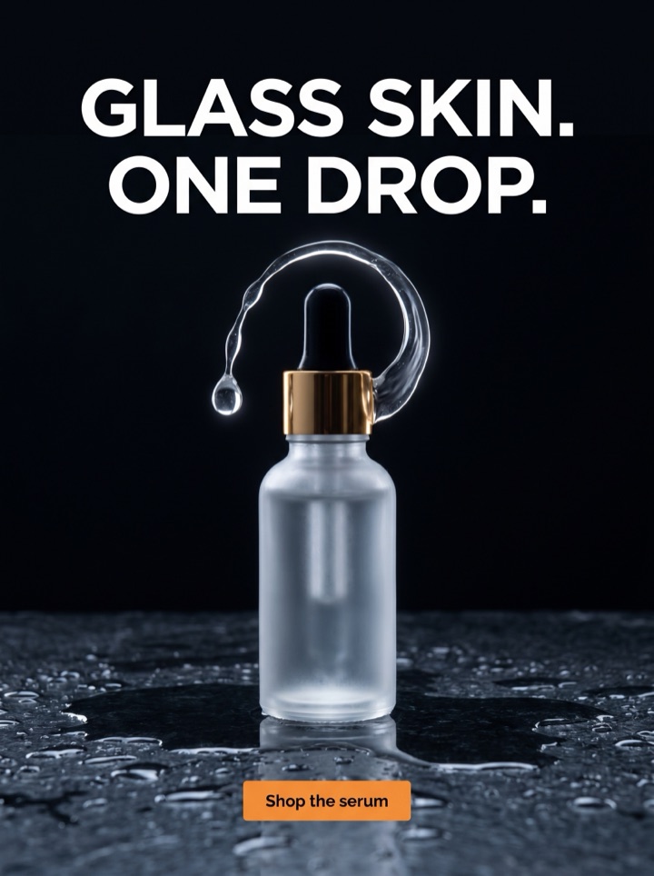
Comparison ad generator examples
Every concept below is built on the comparison angle: the product is shown against an alternative the shopper already knows. The contrast does the persuading, so the layout has to make the favored side obvious before anyone reads a word.


Campaign brief
Comparison ad campaign brief
A comparison ad only works if the audience already has a mental "before" — the messy old way, the bloated competitor, the thing they settle for. These notes help you pick the right contrast before you generate a pack.
Best use
The comparison angle earns its place when your product looks ordinary on its own but obviously better next to the alternative. If the photo already sells itself, a straight product or social-proof angle will beat it.
Pick the foil
Decide what you are comparing against before you write a word: the old way, a clunky category, a DIY workaround, or a generic rival. The foil is the real headline — the product is just the payoff.
First test
Run two contrasts side by side: product vs. the old way, and product vs. the cheap alternative. Keep the same crop and CTA so you learn which foil the audience actually cares about beating.
Format choice
Split-frame and before/after layouts breathe best at 1:1 and 4:5. A two-column versus checklist gets cramped in 9:16, so reserve story placements for a stacked before-and-after instead.
Copy direction
Label each side in plain words — "Theirs / Ours", "Before / After", "The old way / This" — and let one line name the single difference that matters. Resist listing five differences; the eye only reads one.
Human review
Check that the favored side is unmistakable in a half-second squint. If a shopper could confuse which half is the product, the contrast has failed no matter how good the copy is.
How it works
Build a comparison ad around the contrast, not the product alone.
1
Name the alternative
Start by deciding what the shopper is comparing against — the old way, a rival category, or a workaround. That foil drives every layout choice that follows.
2
Pick the contrast shape
Generate the comparison as a split-frame versus, a stacked before/after, or a two-column checklist. Each makes the same point with a different rhythm.
3
Preview the read
Review view-only previews and squint: does the favored side jump out instantly? Comparison ads live or die on that first half-second of recognition.
4
Export what reads
Unlock high-res files only once the contrast holds at feed size, where a too-busy two-sided layout usually collapses into noise.
Examples
Comparison ad generator examples
Comparison rarely runs alone in a test. It plays well against a proof-led or premium control, and a flash-sale variant tells you whether the contrast or the price is doing the real work. Product AdKit gives each angle its own layout, not just a swapped headline.
Field notes
Comparison ad field notes
These are the small judgment calls that separate a comparison ad that converts from one that just looks like a chart. They are the human review layer behind every split-frame and before/after concept.
Creative review
- Compare against a behavior or a category, not a named brand. "The old way" and "the generic version" persuade without inviting trademark complaints or a Meta rejection.
- The foil has to be one the audience genuinely recognizes. If shoppers do not already resent the alternative, there is nothing for the contrast to push against.
- Stack the deck visually but not dishonestly: light, crop, and color can favor your side, yet the claim on each label still has to be true on the product page.
- Pick the single difference that decides the purchase. A comparison that wins on five small points usually loses because no one finishes reading it.
Placement review
- At phone width, a two-column versus shrinks fast. Test the layout at feed size and cut any label that turns into a gray smudge.
- Keep the two sides visually parallel — same shape, same framing — so the eye reads the difference, not the inconsistency. Asymmetry reads as a mistake, not a point.
- Direction matters: put the alternative on the left and the product on the right so the eye lands on your side last, where it lingers.
Export review
- A paid comparison pack is worth unlocking when at least two previews use genuinely different foils, not the same split-frame with the labels reworded.
- Use the product's real details — texture, ingredients, build, size — as the proof on your side instead of a generic "better" badge that any brand could claim.
- The last check is the squint test: from across the room, is it obvious which half is the product and why it wins? If not, fix the contrast before paying for the file.
Sizes and exports
Sizes and exports for comparison ads
A comparison ad has two things to fit instead of one, so the export shape matters more than usual. Static posters are available first; display and HTML5 exports stay clearly labeled as agency or roadmap workflows until enabled.
1:1 square
The friendliest shape for a side-by-side versus: a square gives both halves equal room and keeps each label readable in feed.
4:5 feed
Best for a stacked before/after, where the extra height lets the "after" frame sit larger and clearly favored over the "before".
9:16 story/reels
Reserve full-screen vertical for a top-to-bottom before-and-after. A two-column versus rarely survives this crop without crowding.
Facebook feed
Use the 4:5 feed crop when the comparison needs more vertical room than a square but still has to land in the in-feed scroll.
The hardest part of a comparison ad is not the design — it is choosing the right foil and making your side win in a half-second. Product AdKit gives you split-frame and before/after layouts to test that contrast quickly, instead of a blank design surface that leaves the persuasion up to you.
Copy examples
Hooks, CTAs, and mistakes for comparison ads.
Headline hooks
- The old way vs. the way that actually works.
- Why settle for [generic alternative] when this exists?
- Spot the difference. Then never go back.
- One does the job. One just looks like it.
- Theirs takes three steps. Ours takes one.
- Before you reorder the same old thing — look at this.
- Same shelf, same price, completely different result.
- This is what you switch to after the cheap version fails.
CTA examples
- See the difference
- Make the switch
- Compare for yourself
- Upgrade from the old way
- Try the better one
Common mistakes
- Comparing against a foil the audience doesn't recognize, so there's nothing for the contrast to push against.
- Naming a competitor by brand and inviting a trademark complaint instead of contrasting against the category.
- Cramming five differences in when one decisive contrast would have carried the whole ad.
- Letting the two sides look so different in framing that the layout reads as a design error, not a point.
- Stacking the deck with claims the product page can't back up, so the click lands on a promise you can't keep.
Examples
Comparison ad generator examples
Run this pass before turning a comparison preview into a production ad. Each question is about the contrast doing its job.
1
Is the favored side obvious in a half-second squint, before anyone reads a label?
2
Is the foil one the audience already recognizes and quietly resents — or did you invent it?
3
Does the ad rest on one decisive difference rather than a list the eye won't finish?
4
Can every claim on your side be backed up by the actual product page, not just the ad?
5
Are you contrasting against a category or behavior, not a competitor's brand name?
FAQ
Comparison ad generator questions
What is a comparison ad and when should I run one?
A comparison ad sets your product against an alternative the shopper already knows: the old way, a clunky rival category, or the thing they put up with today. Run it when your real selling point only lands once the buyer sees the contrast, not when the product can sell on its own looks.
Can I build a side-by-side this vs. that layout?
Yes. Product AdKit can generate split-frame and before/after comparison layouts where your product holds the favored side. You steer the headline, the labels on each side, the CTA, and the crop up front, and regenerate until the contrast reads in one glance before paid export.
Should a comparison ad name a competitor by brand?
Usually no. The strongest comparison ads contrast against a category or a behavior, not a named rival, which keeps you out of trademark trouble on Meta and avoids giving a competitor free attention. Compare against the old way or the generic version instead.
Can I export comparison ads without a watermark?
Free comparison ad previews are full-quality and view-only. Paid packs unlock high-res, no-watermark exports and ZIP downloads, so you only pay once a split-frame concept is clearly worth running.
Related tools