Facebook ad maker
Facebook ad maker for products
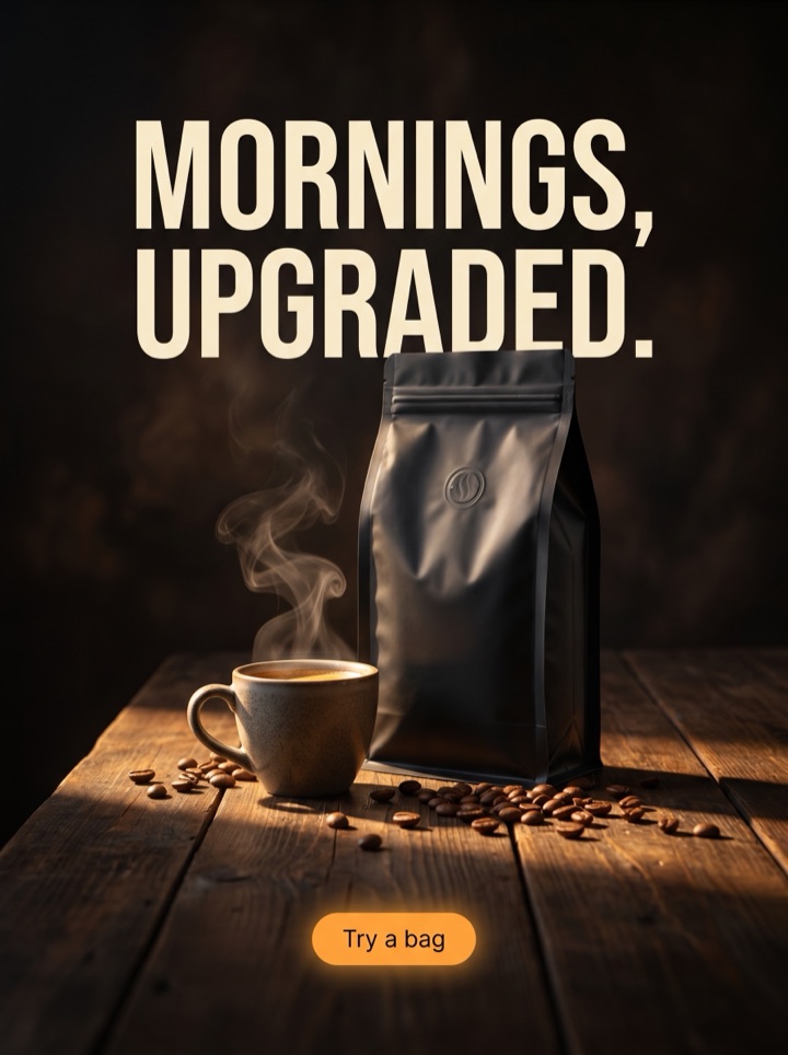
Upload one product shot and get feed-ready 1:1 and 4:5 ad variations built to stop the scroll between a friend's photo and a news post. The hook lives on the image; the offer and Shop Now line up in the ad fields below.
Free Facebook feed previews are full-quality and view-only so you can pressure-test the hook at thumb size before spending a cent. Unlock the full pack only when a creative earns it: high-res 1:1 and 4:5 files, no-watermark assets, and a ZIP you can drop straight into Meta Ads Manager.
Examples
Facebook ad maker for products examples
Every example here is framed for the Facebook feed: a single image that has to survive the half-second between a friend's vacation photo and a shared news link. They are sized 1:1 and 4:5, the two shapes that hold the most height before Meta crops, and the burned-in copy is kept short enough to read on a phone.


Campaign brief
Facebook feed campaign brief
The Facebook feed is an interruption surface: your ad sits between content people actually chose to see, so it has to earn the stop on its own. Use these notes to turn one upload into a creative that holds up against organic posts, not just against other ads.
Best use
Reach for the Facebook ad maker when you have one product image strong enough to anchor a feed unit and you want to test three hooks fast, before you commit budget in Ads Manager.
Asset to upload
Use a clean product shot with breathing room near the top, where the on-image hook sits. The Facebook crop is unforgiving, so keep the product away from the very edges of the square.
First test
Hold the product crop steady and vary only the angle: one offer-led, one proof-led, one curiosity hook. The feed rewards the one that stops the thumb, and you cannot read that signal if everything changes at once.
Format choice
Lead with 4:5 portrait for mobile feed reach, keep 1:1 square as the desktop and right-column fallback, and only consider other placements once the product still reads at phone size.
Copy split
Decide what goes on the image versus in the ad fields. The burned-in hook stops the scroll; the primary text and headline carry the offer and the Shop Now reason. Do not duplicate them word for word.
Human review
Before you publish, mute the sound in your head and look at the thumbnail at the size it will actually appear. If you cannot tell what the product is in a glance, the feed will scroll right past it.
How it works
From one product photo to a feed test in four steps.
1
Upload the product shot
Drop in one clean photo. Product AdKit reads it as the anchor of the feed unit and keeps it the largest thing in the frame.
2
Pick the scroll-stopper
Choose the angle that fits this audience: a sharp offer, a five-star quote, a problem-then-fix split, or a quiet premium frame.
3
Preview at thumb size
Judge the view-only 1:1 and 4:5 previews the way Meta will show them, small and mid-scroll, before you pay for anything.
4
Export and load into Ads Manager
Unlock high-res, no-watermark files and a ZIP once a creative is clearly worth testing as a real feed campaign.
Examples
Facebook feed ad examples
The feed punishes ads that look like ads, so the angle matters more than the polish. These are the directions that tend to earn a thumb-stop on Facebook, where the audience is broad, the mood is casual, and trust signals do a lot of the work.
Field notes
Facebook feed field notes
These are the small, specific calls that separate a feed ad that gets scrolled past from one that earns the stop. They come from how Facebook actually renders and ranks a static image unit.
Creative review
- The first job is a thumb-stop, not a sale. On Facebook the ad competes with baby photos and breaking news, so the image has to register what the product is in well under a second.
- High contrast and a human or product hero beat busy collages. The feed is a noisy background, and an ad that matches that noise disappears into it.
- Keep the burned-in headline short. Meta has a long history of throttling text-heavy creative, and long copy is unreadable at thumbnail size anyway.
- A proof angle, like a five-star quote laid over the product, often outperforms a discount on Facebook because the audience is colder and trust is the gap.
Placement review
- Treat the on-image hook and the ad's primary text as two different jobs. The image stops the scroll; the text below carries the offer and the Shop Now button.
- Do not repeat the same sentence in both places. Repetition wastes the one extra line Facebook gives you to expand the reason to click.
- Pick a 4:5 portrait as your mobile-feed default. It claims more vertical height than the square and pushes competing posts further down the screen.
Export review
- Unlock a paid pack once two or three previews show genuinely different buying reasons, not the same layout with a swapped headline. Meta needs distinct creative to learn.
- If the product has real texture, packaging, or scale, show it instead of stacking generic SALE badges. Tangible detail reads as authentic in a feed full of polished ads.
- Before export, check the creative inside the Ads Manager preview at mobile width. Plenty of ads that look sharp at full size lose the product entirely once Facebook crops them.
Sizes and exports
Sizes and exports for the Facebook feed
Pick the shape for the placement you are actually buying. Static feed posters are live first; vertical Story and Reels framing and any display or HTML5 packs stay clearly labeled as agency or roadmap workflows until they ship.
4:5 portrait (recommended)
The default for mobile Facebook feed. It wins the most vertical height before the crop, pushing competing posts down and giving the offer line more room.
1:1 square
The safe cross-placement shape. Use it when the same creative also has to run on desktop feed or in the right-hand column without re-cropping.
Right column thumbnail
Desktop right-column ads render small, so keep the product big, the text minimal, and assume the headline does most of the work in the ad fields.
9:16 Story / Reels
Full-screen vertical for Facebook Stories and Reels placements. Available as a roadmap framing; for vertical-first creative, start from the Instagram ad maker today.
Canva hands you an empty artboard and a font picker. This is built for the one job a Facebook feed test needs: one product photo in, three scroll-stopping hooks out, sized 1:1 and 4:5, with the offer copy and Shop Now reason already split between the image and the ad fields. You spend your time choosing the winner, not nudging text boxes.
Copy examples
Hooks, CTAs, and mistakes for Facebook feed ads.
Headline hooks
- "Wait, why is this only [price]?"
- The [product] your feed keeps showing you.
- 4,000 five-star reviews can't all be wrong.
- Sold out twice. Back in stock today.
- If you scroll past this, that's on you.
- The upgrade you didn't know you needed.
- Stop overpaying for [category].
- Made for people who hate [the old way].
CTA examples
- Generate free preview
- Shop Now (Facebook CTA button)
- Get 20% off your first order
- See why 10k people switched
- Limited stock — order today
Common mistakes
- Cramming a paragraph of text onto the image, where it gets throttled by Meta and is unreadable at thumb size anyway.
- Leaving the product tiny or off-center, so the feed crop hides the one thing the ad is selling.
- Repeating the image hook word-for-word in the primary text instead of using it to expand the offer.
- Testing five variables at once, so when one ad wins you have no idea which change earned the stop.
- Designing for the full-size preview, not for the small, mid-scroll thumbnail Facebook actually serves.
Examples
Facebook feed ad examples
Run this quick pass on any creative before you push it into Ads Manager. It catches the things that quietly kill feed performance.
1
At thumbnail size, can you tell what the product is in under a second without reading any text?
2
Is the burned-in copy short enough to read on a phone and to clear Meta's text-heavy habit?
3
Do the on-image hook and the primary text say different things, instead of repeating each other?
4
Does the 4:5 crop keep the product and the Shop Now reason visible, not chopped at the edges?
5
Across your three variants, is each one a genuinely different angle so the auction has something to learn?
FAQ
Facebook ad maker for products questions
What sizes does the Facebook ad maker export for the feed?
It builds 1:1 square and 4:5 portrait first, because those are the shapes that hold the most height in the Facebook feed before the image gets cropped. The 4:5 ad usually wins more pixels on mobile; the square is the safe default when the same creative also runs in the right column or on desktop.
Will these ads also work on Instagram, or just Facebook?
The 1:1 and 4:5 creatives carry over to Instagram feed cleanly. The difference is the surrounding chrome: Facebook keeps your primary text, headline, and Shop Now button below the image, so the poster itself can be more visual. If you want vertical Story and Reels framing, start from the Instagram ad maker instead.
Does the headline text live in the image or in the ad fields?
Both are useful, and Product AdKit treats them as separate jobs. The on-image hook stops the scroll; the primary text and headline field below carry the offer and the Shop Now CTA. Keep the burned-in text short so it survives Meta's old text-heavy penalty habit and reads at thumb size.
Can I export Facebook ads without a watermark?
Free feed previews are full-quality and view-only so you can judge the hook before paying. Paid packs unlock high-res, no-watermark 1:1 and 4:5 files and a ZIP download you can drop straight into Meta Ads Manager.
Related tools