luxury product ad generator
Luxury Product ad generator
Turn one product photo into the luxury angle: restrained, high-contrast posters that sell craft and status instead of a discount, ready for Facebook, Instagram, and paid social testing.
Free luxury product ads previews are full-quality and view-only. Unlock the full pack only when the ads are worth exporting as high-res files, no-watermark assets, ZIP download, and Meta sizes.
Examples
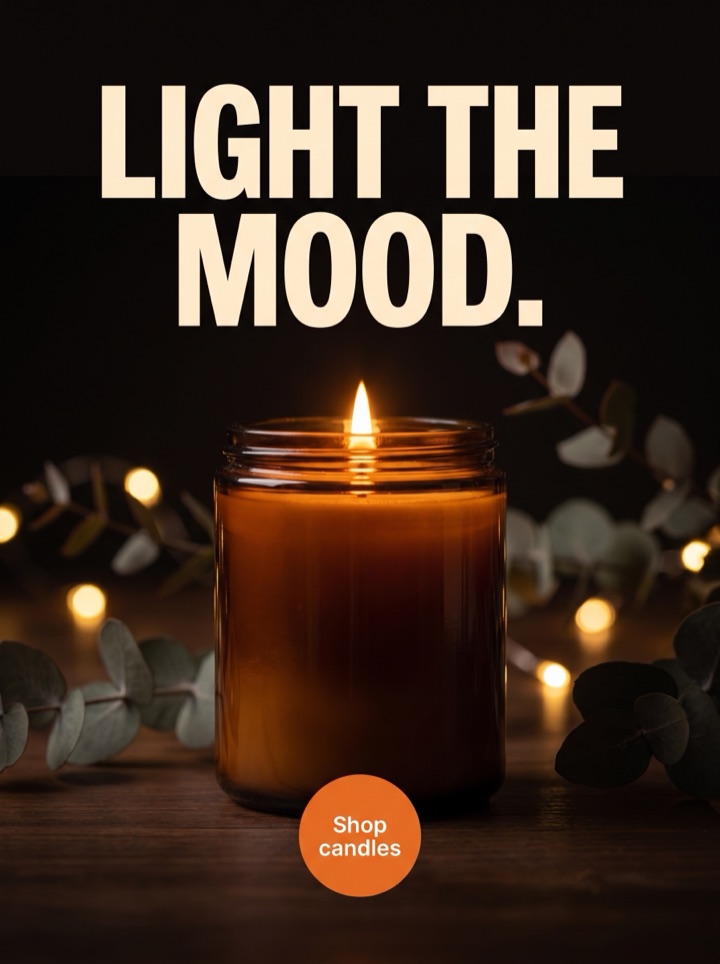
Luxury Product ad generator examples
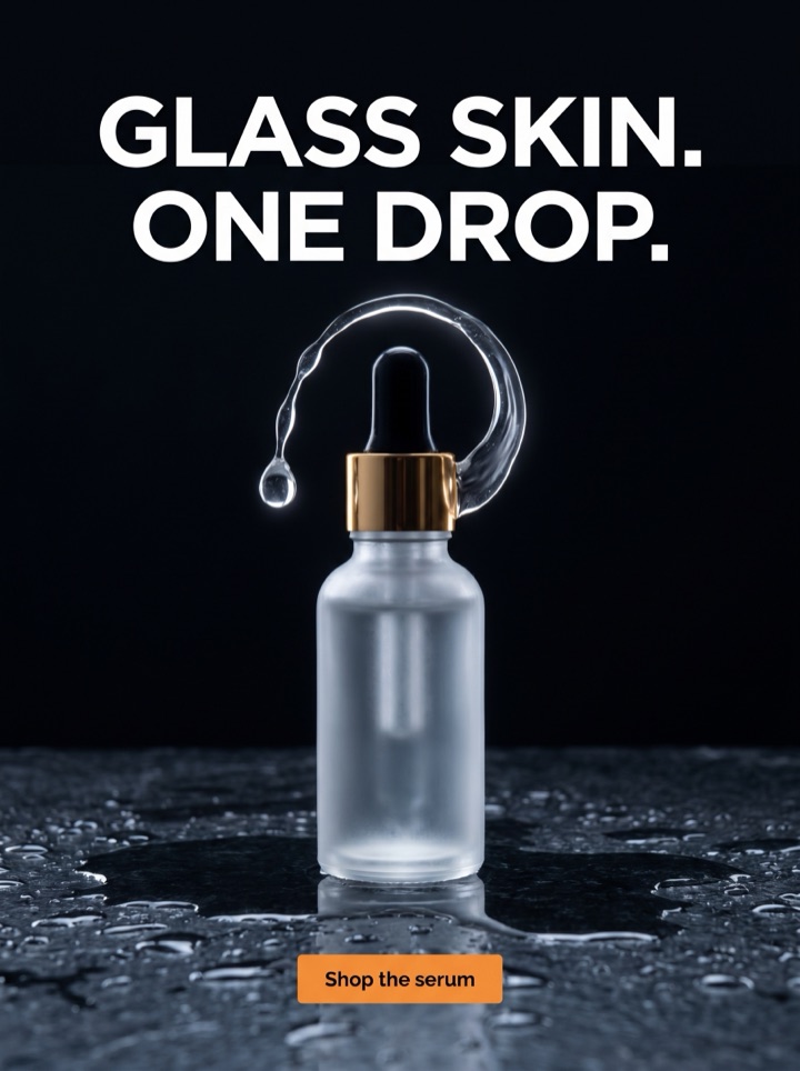
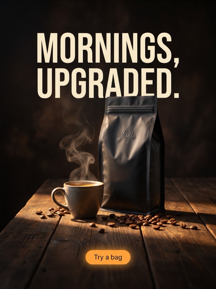
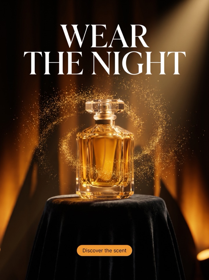
The luxury angle lives or dies on restraint. Every example below leads with the object, leaves generous negative space, and replaces the deal with a single quiet claim. Notice how little is on the page; that emptiness is what reads as expensive.

Campaign brief
The luxury angle: campaign brief
The luxury angle is a deliberate persuasion choice: you raise perceived value rather than lower the barrier. No countdown, no percent off, no shouting. These notes are about running that angle well, not about discounts dressed up in a darker palette.
When this angle wins
The luxury angle is for products where margin, materials, or brand story justify a premium, and where a discount would actually cheapen perception. If you compete mainly on price, run flash-sale instead; this angle protects the price.
The photo it needs
The luxury angle demands a clean, well-lit hero shot with real negative space around it. One true detail, the grain, the weight, the finish, should be visible. Busy backgrounds and clutter break the premium read instantly.
The claim, not the offer
Swap the deal for a single restrained line that signals craft or status: "Made to last a decade," "Hand-finished in small batches." The luxury angle persuades by understatement, so resist stacking benefits.
Palette and type
Quiet luxury reads in the styling: muted or monochrome tones, generous margins, a serif or a light sans set small. Loud colors and bold all-caps urgency pull the ad back toward a clearance flyer.
The CTA
Keep it soft. "Discover the collection," "Explore the range," or "View the piece" fit the luxury angle. A hard "Buy now, 40% off" contradicts everything the rest of the creative is doing.
The honesty check
The luxury angle fails fast if the product page can't back the premium framing. Before you run it, confirm the materials, finish, and price point genuinely support a high-status story.
How it works
How to build a luxury-angle ad from one photo.
1
Pick the hero detail
Decide which one detail carries the craft story, the stitching, the grain, the finish, then choose the photo that lets it breathe. The luxury angle starts by removing, not adding.
2
Choose restraint over offer
Generate premium layouts that lead with the object and a single understated claim. No countdowns, no percent-off badges; the angle works by what it leaves out.
3
Preview the quiet pack
Review view-only previews and keep the ones where the emptiness reads as expensive, not unfinished. If a layout feels busy, drop it before you pay.
4
Export what holds at thumb size
Unlock high-res files when the hero crop and the small serif claim still read in a phone feed. Premium type that vanishes at story scale isn't done yet.
Examples
Luxury-angle ad examples
The luxury angle is a family of moves, not a single look. These are the sub-angles worth testing against each other, all built on restraint and the hero detail rather than a discount.
Field notes
Field notes for running the luxury angle
These are the things that separate a genuinely premium ad from a discount ad wearing a beige palette. The luxury angle is unforgiving: small lapses in restraint are what give it away.
Creative review
- Count the elements on the canvas. If the luxury-angle ad has more than the product, one short claim, and a soft CTA, start cutting; clutter is the fastest way to look mass-market.
- Treat negative space as a feature, not wasted room. The emptiness is what signals confidence and price; filling it with badges undoes the whole angle.
- Pick one hero detail and let it dominate. A macro crop on grain or stitching does more for the luxury angle than three product angles competing for attention.
- Check the claim against a clearance flyer. If you could imagine it next to "While stocks last," it's the wrong register; rewrite it quieter.
Placement review
- Keep the palette muted or monochrome. One saturated accent can read as a fashion choice; three read as a sale graphic. The luxury angle rewards discipline in color.
- Set type small and let it sit in the margin. Oversized all-caps headlines signal urgency, which is the opposite of what this angle is buying you.
- Hold the lighting low-key and directional. Flat, bright product-shot lighting flattens the material story that makes premium framing believable.
Export review
- Before export, ask whether the price and the product page actually earn the luxury angle. If the materials are ordinary, the ad will overpromise and the click will bounce.
- Run the premium version against a proof or craft variation, not against a discount version; the luxury angle is most useful when you learn which status cue resonates.
- The final luxury-angle export should feel almost too quiet. If your instinct says "add one more thing," that instinct is usually wrong for this angle.
Sizes and exports
Sizes and exports for the luxury angle
Premium framing depends on margins, so the shape you choose changes how much room the product gets to breathe. Static posters are available first; display and HTML5 exports stay clearly labeled as agency or roadmap workflows until enabled.
1:1 square
The square is the safe luxury default: it gives the hero product a centered stage with even margins on all sides, which is exactly the balance this angle wants.
4:5 feed
The 4:5 feed crop reads like an editorial page. Use it when the product benefits from a taller frame and you want the claim to sit quietly below the object.
9:16 story/reels
Full-screen story is the most immersive luxury placement: hold the product high, let the lower two-thirds stay empty, and place a single understated tagline at the base.
Facebook feed
For Facebook feed, keep the same restraint but verify the small serif claim survives compression; premium type is the first thing to break at feed scale.
Most founders can describe quiet luxury but struggle to lay it out: the right margins, the single claim, the restraint that reads as expensive. Product AdKit turns one product photo into premium-angle layouts you can judge in seconds, so you decide which craft cue and which crop to test instead of fighting a design tool.
Copy examples
Hooks, CTAs, and mistakes for the luxury angle.
Headline hooks
- Made to outlast the trend.
- Owned, not just bought.
- The detail no one else bothers with.
- Quietly the best in the room.
- Hand-finished. In small numbers.
- A decade from now, still yours.
- Fewer, better things.
- The kind of object you keep.
CTA examples
- Discover the collection
- Explore the range
- View the piece
- See the craftsmanship
- Reserve yours
Common mistakes
- Adding a discount or countdown, which instantly drops the ad from luxury into clearance.
- Crowding the canvas; the luxury angle needs negative space, and badges or stacked benefits kill it.
- Using bright, saturated colors and bold all-caps urgency that read as a sale, not a status piece.
- Framing a product as premium when the materials, finish, or price point can't back the claim.
- Writing a generic benefit line like "great quality" instead of one concrete craft detail the shopper can picture.
Examples
Luxury-angle ad examples
Run a luxury-angle preview through these five questions before you export. The angle fails on the small things, so be strict.
1
Is there a single, concrete craft cue, a material, a finish, a number, that makes this product feel premium rather than just nice?
2
Have you removed every discount, badge, and countdown so nothing undercuts the high-status read?
3
Does the negative space feel intentional and confident, not like an unfinished layout waiting for more copy?
4
Does the small serif or light claim still read at phone-feed size, and not collapse into noise at story scale?
5
Can the product page actually deliver on the premium promise, so the click doesn't bounce on arrival?
FAQ
Luxury Product ad generator questions
What makes the luxury angle different from a normal product ad?
The luxury angle sells status and craft instead of urgency or discount. It uses negative space, a quiet palette, a single hero crop, and a restrained one-line claim. Product AdKit generates premium layouts that lead with the object and the material, not a price badge.
Can I run the luxury angle without lowering my price or adding a discount?
Yes, and you usually should. The luxury angle works by raising perceived value, so it avoids percent-off copy and countdowns. Keep the CTA soft, like Discover the collection, and let the photo and the material story carry the click instead of a deal.
How do I show craftsmanship in a luxury product ad?
Lead with one true detail: stitching, grain, weight, finish, or origin. Crop close enough that the texture reads, give it room to breathe, and put a short claim near it. You steer the headline, the detail crop, and the palette up front, so the proof stays specific to your product.
Can I export luxury product ads for Facebook and Instagram?
Yes. Product AdKit produces Meta-ready static posters first, in square, 4:5 feed, and 9:16 story sizes. Premium previews are view-only; paid packs unlock high-res, no-watermark exports and ZIP downloads.
Related tools